Chapter 1: General information
Chapter Text
This is a simple dark-mode skin with rounded features. It includes color-coded tags and custom icons. (Note that the placement and look of some of the icons has slightly changed since the capturing of some of the example screenshots.)

Custom icons
Here is a preview of what the custom icons look like in action:


Stat icons
Below are examples of the stats icons. All of the stat icons include a tooltip when you hover over the stat that tells you what each stat means in case you ever forget the meaning of one of the icons.
The stats have been replaced with custom icons, here are the icons on a work listing (Language, Words, Chapters, Collections, Comments, Kudos, Bookmarks, Hits):

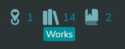
Series listing (Words, Works, Completion Status, Bookmarks):

Stats on a work (Publish date, Update/Completion date, Words, Chapters, Comments, Kudos, Bookmarks, Hits):
Stats on the statistics-section of a profile (Subscriptions, Hits, Kudos, Comment Threads, Bookmarks):

Stats on a collection (Fandoms, Works, Bookmarked items). Note the tooltip that appears below the icon when you hover over it:
Finally, the stat icons for a tag set (Fandoms, Characters, Relationships, Additional/Freeform tags):

Color-coded tags
Relationship, character and freeform tags are color-coded:

The tag that looks different is an example of how the tags will look when you hover over them.
Works

This is what the works themselves look like. The text area has been made slightly narrower on wide screens to make reading a little easier.
Important notes:
This is my first Ao3 skin and CSS project. The code may be a little messy, but I've included some comments in case you want to customise certain parts. (Please note that Ao3 deletes the comments when you save the skin.) I've tried to go through all the pages to make sure all the elements on Ao3 are usable, but if you run into something that doesn't look right (especially on mobile), please leave a comment!
The fonts used are Montserrat (for titles) and Nunito (for main text). In order for them to display as intended, make sure you have them downloaded on your device. The fallback for Montserrat is Roboto, but if you don't have any of the mentioned fonts, the skin will use the Ao3 default fonts.
How to use this skin:
- Go to your profile
- Click on Skins
- Click on Create Site Skin
- Make sure you have Site Skin selected
- Give the skin a unique title, such as "[Your Username ] - DarkVerdigris by Ferager"
- If you'd like, add a link to this work in the description
- Copy all the CSS code in Chapter 2 of this work and paste it in the CSS box
- Click Submit
- Finally, click Use
- In order to make the fonts look right, you should download and install Montserrat and Nunito. You can get them for free here: https://fonts.google.com/specimen/Montserrat and https://fonts.google.com/specimen/Nunito
Credits/Inspiration
The color-coded tags were inspired by ElectricAlice's Site Skin for a border around the tag.
The flattening of the buttons was done with Ao3 Skin - Make the buttons flat.
For the updated icons I used the code and base of HD Ao3 Icon skin, but I got help from Replace the AO3 icons and default images [Site skin] by ZerafinaCSS for the lock and collection icons.
I used Stats icons with hover text [Site skin] as a base for changing the stats from text into icons.
All icons, both the ones on the template and the ones replacing the stats are made by me.
If you want to switch the icons to a different color or use them in another skin, check out my Ao3 default icon replacements.
Updates
2025 February 16 - The current page number was not being properly highlighted when browsing a tag. This has been fixed.
2025 February 15 - Small fixes incl. white backgrounds on Subscriptions-page.
2024 October 18 - Made slight changes to how the progress bar on the donation notification looks.
2024 September 28 - The original Ao3 red would show up in some places re: invalid fields. Colors and other appearance regarding these have been fixed.
2024 August 19 - Fixed the icons and the attached tooltips. At some point something had happened which caused many of the icons to not work right (my guess is Ao3 might have changed their code slightly?) but I have now fixed all the broken ones I could find.
2024 August 11 - Changed the color of the chart on the Statistics-page.
2024 June 22 - Changed the way event notices (the official Ao3 event banners about things like elections) look. Made the CSS on a site skin a scrollable box so that on longer site skins it is easier to reach the edit-button at the bottom of the page.
2024 June 3 - Fixed an issue where some links would appear red when active.
2024 May 24 - Fixed an issue with the background colors of works waiting to be approved in the "Related Works" section of the profile.
2024 May 22 - Changed the color of tag links on hover, because the last fix made already visited links difficult to read when hovering over fandom tags.
2024 May 21 - Fixed the color of visited links. Completely changed the way the stats icons work and changed/added a few more icons. Updated the screenshots to reflect this change.
2024 May 14 - Added an icon to "prompts" on collections.
2024 April 28 - Added icons to the series listings on a user profile. Changed the way the icons are added on collections in order to add the subcollections/challenges icon. Unfortunately this means they look slightly different from other stats and the spacing is weird, but I may change this in the future.
2024 April 27 - Fixed an issue where the search bar would extend past the edge of the page on mobile.
2024 April 26 - Added icons to external bookmarks.
2024 April 25 - Added a fix for the "Related Works" page on the user profile. (There may be issues in Sign-ups, Assignments, Claims and Gifts, but since I do not have any works on those pages, I am unable to check at the moment) Fixed several issues I found while editing bookmarks.
Known issues (not yet fixed, if you have a solution for any of these, let me know)
- In a few places the red color that is a part of the default Ao3 theme pushes through. I've noticed it mainly on mobile when clicking certain buttons and in more rarely used places like the search box on tag sets. I have so far decided to just ignore these since it does not affect the usability.
NOTE - 2025 September 17
Ao3 has made some updates to their code, which has "broken" certain parts of this skin. I have decided to no longer make updates to this skin unless something major breaks that bothers me personally. In the future I hope to make an entirely new skin with a similar vibe to replace this one.
Chapter 2: CSS code
Chapter Text
body,
#header,
#outer {
background-color: #1d1d1d;
color: #fcfefe;
}
/*These change the fonts & their sizes*/
body {
font-size: 105%;
}
body,
blockquote,
pre,
input,
textarea,
.toggled form,
.dynamic form,
.secondary,
.dropdown,
.bookmark .user .meta {
font-family: Nunito, "Open Sans", "Lucida Grande", "Lucida Sans Unicode", Verdana, Helvetica, sans-serif, "GNU Unifont";
}
h1,
h2,
h3,
h4,
h5,
h6 {
font-family: Montserrat, Roboto, Georgia, serif !important;
}
/*Changes the look of text boxes*/
input,
select,
textarea {
background-color: #1a2224;
color: #fcfefe;
border-radius: 3px;
border: 1px solid #2c3233;
}
input:focus,
select:focus,
textarea:focus {
background-color: #171d1e;
color: #fcfefe;
outline: 1px dotted #fcfefe;
}
input {
width: 96%;
background-image: none;
box-shadow: none;
}
fieldset,
form dl,
fieldset dl dl,
fieldset fieldset fieldset,
fieldset fieldset dl dl,
dd.hideme,
form blockquote.userstuff {
background: #2c3233;
color: #fcfefe;
border: none;
}
fieldset fieldset,
fieldset dl dl,
form blockquote.userstuff {
background: #434849;
color: #fcfefe;
}
.dynamic form {
background-color: #2a2a2a;
border: 2px solid #2a2a2a;
border-radius: 1em;
}
div.dynamic,
.own {
background-color: transparent;
}
/*Changes the font color of the required fields on forms*/
.required,
.error,
.alert.flash {
color: #fcfefe;
font-weight: 600;
}
fieldset .required,
fieldset .error,
fieldset .alert.flash {
color: #d05d69;
}
/*Removes white backround on unsubscribe-button*/
dl.index dd {
background: transparent;
}
/*Notice and error messages etc.*/
.notice,
.comment_notice,
.kudos_notice,
ul.notes,
.caution,
.error,
.comment_error,
.kudos_error,
.alert.flash,
.reading h4.viewed {
background: #a273ba;
box-shadow: none;
border: none;
}
.notice a,
.notice a:link {
color: #a3cdd0;
}
.event .userstuff {
background-image: none;
background-color: #9d3641;
}
.alert .userstuff,
.event .userstuff {
border-radius: .5em;
border: none;
}
.announcement .userstuff {
border-radius: .5em;
}
.announcement input[type="submit"],
.announcement .action {
border: none;
}
.LV_invalid {
background: #9d3641;
border: none;
color: #fcfefe;
box-shadow: none;
}
.LV_invalid_field,
input.LV_invalid_field:hover,
input.LV_invalid_field:active,
textarea.LV_invalid_field:hover,
textarea.LV_invalid_field:active {
border: 1px dashed #9d3641;
}
.LV_invalid::before {
border: none;
}
.LV_validation_message {
font-weight: 600;
}
.announcement .thermometer .track {
border: none;
background-image: none;
background: #fcfefe;
border-radius: 1em;
}
.announcement .thermometer .progress {
border-radius: 1em;
}
#dashboard ul:first-of-type,
#footer,
.filters .group dt.bookmarker,
form.search input[type="text"] {
border-top: none;
}
/*Makes the CSS on site skins a scrollable box*/
.css blockquote {
max-height: 70vh;
overflow: auto;
background: #2a2a2a;
border-radius: .75em;
border: 8px solid #2a2a2a;
padding: .5em;
}
/*Makes all user/collection etc. icons round*/
.icon,
.icon img {
border-radius: 50%;
}
/*These remove shadows on elements*/
#header .menu,
#small_login,
#header .dropdown:hover .current+.menu {
box-shadow: none;
background-image: none;
filter: none;
}
.listbox .index,
.dashboard .listbox .index,
form .notice,
form ul.notes,
form.verbose legend,
.verbose form legend,
.actions a,
.actions a:link,
.action,
.action:link,
input[type="submit"],
button,
.current,
.actions label {
border: none;
border-bottom: none;
background-image: none;
box-shadow: none;
}
.notice,
.comment_notice,
ul.notes,
.caution,
.error,
.comment_error,
.alert.flash,
.actions a:hover,
.actions input:hover,
.actions a:focus,
.actions input:focus,
label.action:hover,
.action:hover,
.action:focus,
.notice,
.comment_notice,
ul.notes,
.caution,
.error,
.comment_error,
.alert.flash,
.actions a:hover,
.actions input:hover,
.actions a:focus,
.actions input:focus,
label.action:hover,
.action:hover,
.action:focus {
border: none;
box-shadow: none;
}
#header .primary,
.group.listbox,
fieldset fieldset.listbox,
#main li.blurb,
.wrapper,
#dashboard .secondary,
.secondary,
form blockquote.userstuff,
.thread .comment,
.toggled form,
#header .primary,
.listbox .index,
form .notice,
form ul.notes,
form.verbose legend,
.verbose form legend,
span.question,
fieldset,
form dl,
fieldset dl dl,
fieldset fieldset fieldset,
fieldset fieldset dl dl,
dd.hideme,
form blockquote.userstuff,
.delete a,
span.delete,
#header ul.primary {
box-shadow: none;
}
.actions a:hover,
a:hover,
.actions input:hover,
#dashboard a:hover,
.actions a:focus,
.actions input:focus,
#dashboard a:focus,
.actions a:active,
.current,
a.current,
.current a:visited,
.actions a:hover,
.actions input:hover,
#dashboard a:hover,
.actions a:focus,
.actions input:focus,
#dashboard a:focus,
.actions a:active,
.current,
a.current,
.current a:visited,
#dashboard .current,
.actions a:active,
#outer .current,
#header .current,
a.current,
.current a:visited,
span.unread,
.replied,
span.claimed,
dl.index dd,
.own,
.draft,
.draft .unread,
.child,
.unwrangled,
.unreviewed,
.ui-sortable li:hover,
#header .primary .menu .current {
border-color: initial;
box-shadow: none !important;
}
.actions input,
input[type="submit"],
textarea {
background-image: none;
box-shadow: none;
-webkit-appearance: none;
}
.actions a,
.actions a:link,
.action,
.action:link,
button,
.current,
.actions label {
border: none;
background-image: none;
box-shadow: none;
-webkit-appearance: none;
}
a:hover,
.button,
input[type="submit"],
.filters .expander:hover {
cursor: pointer;
}
.actions input[type="checkbox"] {
-webkit-appearance: checkbox;
-moz-appearance: checkbox;
}
/*These affect the look of links and buttons*/
a,
a:link,
.blurb h4 a:link {
color: #59a7af;
}
a:visited,
a:visited:hover,
.bookmark .count a,
.userstuff h2 {
color: #008f99;
}
a.tag:visited:hover {
color: #fcfefe;
}
.action a:link,
div#dashboard.region.own ul.expandable.secondary li a {
color: #121212;
}
.actions a,
.actions a:link,
.actions input,
.current,
.action,
.action:link,
.actions label,
input[type="submit"],
button {
background-color: #73b4ba;
color: #1d1d1d;
}
.current,
.pagination .current {
background-color: #4d888e;
color: #1d1d1d;
}
.pagination .current:hover {
cursor: default;
}
.actions a:hover,
.actions a:active,
.actions a:focus,
.actions a:link:hover,
.actions a:link:active,
.actions input:hover,
.actions input:active,
.actions input:focus,
.current:hover,
.current:active,
.action:focus,
.action:hover,
.action:active {
background-color: #3b9ba4;
color: white;
}
a.tag,
a.tag:visited,
a.tag:link {
display: inline-block;
padding: 3px 6px;
margin: 4px 0px;
border-radius: 5px;
border: none;
}
a.tag:hover,
a.tag:active,
.listbox .heading a.tag:visited:hover {
background-color: #59a7af;
}
/*HEADER-related settings*/
#greeting {
margin-top: .375em;
}
/*changes the Ao3 logo into the blue version*/
#header .logo {
margin-top: 4px;
background: url("https://64.media.tumblr.com/0340e610feba70c6ebc6657b0231f31a/243f38d66243f969-39/s100x200/0e288f18ebe896cbc285558814e4a10e7cd037bb.png");
background-size: 61px;
width: 0 !important;
height: 0 !important;
padding: 42px 2px 0 61px;
background-repeat: no-repeat;
}
#header .heading a,
#header .heading a:visited {
color: #73b4ba;
}
.heading span {
font-size: 90%;
}
#header .heading sup {
font-size: .480em;
}
#header .user a,
#header .primary .dropdown:hover a,
#dashboard a,
#dashboard span,
.post .required .warnings,
dd.required,
form dd.required,
.tags a.tag,
li.added.tag {
color: #fcfefe;
}
#header .user a:hover,
#header .user a:focus {
color: #8cc0c5;
}
#header .menu,
#header .dropdown .menu a,
#header .actions a:hover,
#header .dropdown:hover a {
background-color: #2c3334;
}
#header .dropdown .menu a:hover {
background-color: #73b4ba;
color: #2a2a2a;
border-radius: 3px;
}
#header .dropdown-toggle:hover,
#header .dropdown:hover a {
border-radius: 5px 5px 0px 0px;
}
#header .menu li,
form dt,
.comment div.icon,
.picture .header,
.splash .news li {
border-bottom: none;
}
#header .user .menu {
width: 15em;
border-radius: 5px 0px 5px 5px;
}
#header .primary {
height: fit-content;
display: flex;
align-items: center;
flex-wrap: wrap;
}
#header .primary .menu {
border-radius: 0px 5px 5px 5px;
}
#header ul.primary,
#outer #footer {
background-image: none;
background-color: #73b4ba;
}
#header .primary a,
#footer .group .heading,
#footer li,
#footer a {
color: #2a2a2a;
}
#header .actions input {
background: #2c3334;
color: #fcfefe;
}
#header .search {
margin-left: auto;
display: flex;
}
#header .search .text {
margin: auto .429em;
}
#header #search input:focus {
color: #f4fafa;
outline: 1px dotted;
}
#header h2 {
background: #3b9ba4 !important;
color: #2a2a2a;
padding: 0 1.5em;
border: none;
}
/*Hides the tooltip that pops up when you use the search bar on the header*/
#site_search_tooltip {
visibility: hidden;
}
form.verbose legend,
.verbose form legend {
background: #3b9ba4;
color: #fcfefe;
border-radius: 5px;
}
/*Dashboard-related settings*/
#dashboard {
margin-left: 0;
}
#dashboard,
#dashboard.own {
border: none;
background: #2c3233;
border-radius: 0 8px 8px 0;
}
#dashboard ul {
border-top: 2px solid #fcfefe;
}
#dashboard .current {
background: #a3cdd0;
color: #2a2a2a;
}
.secondary {
background: #a3cdd0;
border: none;
}
#dashboard.admin.region li:nth-of-type(2n) a {
background: #171d1e;
border-radius: 5px;
}
/*Changes the color on the graph on the statistics-page*/
#stat_chart {
filter: hue-rotate(180deg);
margin-bottom: 2em;
}
#stat_chart svg > rect {
opacity: 45%;
}
/*Makes the text on the statistics-graph a little smaller*/
#stat_chart g > g > g > text {
font-size: 80%;
}
/*Settings relating to all the different "boxes", such as individual fics, fandoms-box on the profile etc.*/
.listbox,
.listbox .index,
fieldset,
fieldset fieldset.listbox,
dl.meta.series.group,
.toggled form {
background: #212627;
border: 2px solid #212627;
border-radius: 10px;
}
dl.meta.series.group,
.filters dt:first-of-type,
.toggled form {
margin-top: 4px;
}
.listbox .index {
padding-top: 0.2em;
}
.listbox > .heading,
.listbox .heading a:visited {
color: #008f99;
margin-left: 5px;
margin-top: 5px;
}
li.blurb,
fieldset,
form dl,
.dashboard .own,
.work .wrapper,
div#main.works-show.region .wrapper,
div.user.home.profile dl.meta,
dl.inspired.index.group dd.child,
dl.inspired.index.group dd.parent {
background-color: #2c3334;
border: 2px solid #2c3334;
border-radius: 10px;
}
dl.inspired.index.group dd.child {
margin-top: 5px;
}
dl.inspired.index.group dt.child {
background-color: transparent;
}
dl.meta,
div.comment,
.filters .indicator::before,
.favorite a.tag {
border: none;
}
.meta > dt {
padding-left: 20px;
}
.blurb ul.required-tags li,
.blurb ul.required-tags li a,
.blurb ul.required-tags li span {
border-radius: 5px;
}
#user-works > ul.actions {
margin-top: -10px;
margin-right: 8px;
margin-bottom: 5px;
}
.home .primary {
margin-bottom: 0.15em;
}
.home .header h2 {
margin-left: 115px;
text-align: left;
padding-top: 15px;
border-bottom: 1px solid #73b4ba;
line-height: 1.3;
}
/*These affect the little help-question marks on forms*/
span.symbol {
color: #008f99;
font-family: Nunito, Georgia, serif;
border: none;
}
span.question {
background: #fcfefe;
}
/*This changes the popup that shows up when you click on the help-question mark*/
#modal {
background: #171d1e;
border: 5px solid #fcfefe;
border-radius: 1em;
}
/*Search- & filters related settings*/
#new_bookmark_search.search fieldset dl dd ul dd {
float: none;
width: 100%;
align-items: initial;
display: flex;
}
/*changes the little arrow on filter menus to a blue and rounded one*/
.filters .expander {
background-image: url(https://64.media.tumblr.com/6712c1e7fe6edf7f41fa4d7ecafd3b69/243f38d66243f969-df/s75x75_c1/617f86a6602c65552500f85a0c27f5b85a5d8537.png);
background-size: 8px 8px;
color: #a3cdd0;
}
/*changes the little arrow on filter menus to a blue and rounded one when the menu is open*/
.filters .expanded .expander {
background-image: url(https://64.media.tumblr.com/b5cd8ae88b130e61cbcf3af10a39451e/243f38d66243f969-ba/s75x75_c1/2b735c8ec10e19ee270cb9bf7663ad1f89aa6036.png);
}
/*Adds a dashed line on the expanded filter menus.*/
.filters .expandable {
margin-left: 4px;
border-left: 1px dashed #fcfefe;
padding-left: 4px;
}
/*These settings make the checkboxes in the filter menus a little smaller and change them to fit the theme*/
.filters [type="checkbox"] + .indicator::before {
font-size: 12px;
}
/* changes the include-checkboxes */
.filters [type="checkbox"]:checked + .indicator::before {
background-color: #84ba73;
background-image: none;
color: #fcfefe;
}
/* changes the exclude-checkboxes */
.filters .exclude [type="checkbox"]:checked + .indicator::before {
background-color: #d05d69;
background-image: none;
color: #fcfefe;
}
.filters .indicator::before {
background-image: none;
background-color: #fcfefe;
}
.filters dt:last-of-type {
margin-bottom: 2px;
}
.autocomplete div.dropdown ul,
.dropdown {
background: #2c3233;
color: #fcfefe;
border: none;
border-radius: 5px;
}
.autocomplete .dropdown ul li:hover,
.autocomplete .dropdown li.selected {
background-image: none;
background-color: #3b9ba4;
}
.autocomplete input {
margin-left: 2px;
margin-bottom: 2px;
}
/*This affects the calendar-popup on the filter menu*/
.ui-datepicker table {
background: #434849;
}
/*This basically hides certain (useless, imo) elements in the filter menu*/
dd.more.group dt.options,
dd.more.group dd.options ul li dt,
#bookmark-filters.narrow-hidden.filters dd.more.group dd.options ul li dd label,
#new_bookmark_search.search fieldset dl dd ul dt {
color: transparent;
font-size: 1px;
}
dd.more.group dd.options,
dd.more.group dd.options ul li dd {
margin-top: 0;
}
/*These affect specifically the collection-filters*/
#collection-filters fieldset dl dd:nth-of-type(6),
#collection-filters fieldset dl dd:nth-of-type(7),
#collection-filters fieldset dl dd:nth-of-type(8) {
margin-top: 0.12em;
}
/*These affect the collection-page*/
div.collection.home.profile h3.heading {
background: #2c3233;
border-radius: 5px 5px 0 0;
margin-bottom: 0;
padding: 5px;
}
div.collection.home.profile div.wrapper {
background: #2c3233;
border-radius: 0 0 5px 5px;
}
.status .count {
border-radius: 5px;
}
/*Bookmark-related settings*/
.bookmark .user {
border-radius: 5px;
border: 1px solid #8cc0c5;
}
/*Makes the reading area narrower on larger screens*/
div.work div.userstuff.module,
div#main.works-show.region div.userstuff {
max-width: 800px;
margin-left: auto;
margin-right: auto;
}
/*Changes the line-height on the list of people who left kudos, making the list easier to read*/
p.kudos a {
line-height: 1.7;
}
/*Changes the look of comments*/
li.comment,
.thread .even,
.thread .odd {
border-radius: 10px;
border: 4px solid #2c3334;
background-color: #2c3334;
padding-left: 2px;
padding-top: 2px;
}
.comment h4.byline,
.statistics .index li:nth-of-type(2n),
div.draft.work,
.chapter.draft {
background-color: #2c3334;
}
ul.tags.index.group li {
margin-bottom: .01em;
}
/*Changes the look of the 'unread' button on comments in the inbox (plus the hovered items on dashboard)*/
span.unread,
.replied,
span.claimed,
.actions span.defaulted,
#dashboard a:hover {
background: #fcfefe;
color: #008f99;
}
/*Settings that affect the home page*/
.splash {
display: flex;
flex-wrap: wrap;
}
.splash .module {
height: fit-content;
}
.splash .module h3 {
color: #008f99;
border-bottom: 1px solid #8cc0c5;
padding-bottom: 4px;
}
/* changes the background color of every other favorite tag when you hover on them */
.splash .favorite li:nth-of-type(2n+1) a:hover,
.splash .favorite li:nth-of-type(2n+1) a:focus {
background: #008f99;
}
.splash .favorite li:nth-of-type(2n+1) a,
#ui-datepicker-div {
background: #2c3233;
}
.logged-in .splash > .module {
border-radius: 1em;
padding: 0 8px 2px 8px;
background: #282828;
width: 45%;
}
/*Settings that affect the tags on works. This one removes the commas.*/
.commas li:after {
content: "";
}
h5.fandoms.heading {
color: transparent;
}
/*The following changes the relationship, character and freeform tags into different colors.*/
.tags li.relationships a.tag {
background-color: #9a414d;
color: #fcfefe;
border: 2px solid #9a414d;
padding: 1px 4px;
}
.tags li.characters a.tag {
border: 2px solid #629851;
background-color: #629851;
color: #fcfefe;
padding: 1px 4px;
}
.tags li.freeforms a.tag {
border: 2px solid #4d888e;
background-color: #4d888e;
color: #fcfefe;
padding: 1px 4px;
}
/*These change the tag colors when you hover on them.*/
.tags li.relationships a.tag:hover,
.tags li.relationships a.tag:active {
border: 2px solid #9a414d;
background: none;
}
.tags li.characters a.tag:hover,
.tags li.characters a.tag:active {
border: 2px solid #629851;
background: none;
}
.tags li.freeforms a.tag:hover,
.tags li.characters a.tag:active {
border: 2px solid #4d888e;
background: none;
}
/*This changes the text color of tags you have visited.*/
.tags li.relationships a.tag:visited,
.tags li.characters a.tag:visited,
.tags li.freeforms a.tag:visited {
color: #D9D9D9;
}
/*Icon-related settings. This one makes it so that all icons use my custom set of icons.*/
p.kudos,
.required-tags .rating-general-audience,
.required-tags .rating-explicit,
.required-tags .rating-mature,
.required-tags .rating-teen,
.required-tags .rating-notrated,
.required-tags .category-femslash,
.required-tags .category-gen,
.required-tags .category-slash,
.required-tags .category-het,
.required-tags .category-multi,
.required-tags .category-other,
.required-tags .category-none,
.required-tags .complete-no,
.required-tags .complete-yes,
.required-tags .warning-yes,
.required-tags .warning-no,
.required-tags .warning-choosenotto,
.required-tags .external-work,
.status .private .text,
.status .public,
.status .hidden,
.status .rec,
.status .count,
.index .skins .icon,
.index .mystery .icon,
.index .tagset .icon,
.comment .icon .anonymous,
.comment .icon .visitor,
.abbreviated .icon .anonymous,
.abbreviated .icon .visitor,
.skins .primary .icon,
.admin .primary .icon,
.tagset .primary .icon,
img[src="/images/lockblue.png"],
.collection.index .icon[src="/images/skins/iconsets/default/icon_collection.png"],
.collection .icon img[src="/images/skins/iconsets/default/icon_collection.png"],
a.rss span {
background-image: url(https://64.media.tumblr.com/0ebb41c172c930f638af6d7bcfcab3b6/7e3fed2534c1ae72-c8/s1280x1920/f794e99ba66302db133a943393a800b0569626ef.png) !important;
background-size: 200px 735px !important;
}
/*This removes the original icons on the lock of locked fics and the default icon of collections.*/
img[src="/images/lockblue.png"],
.collection .icon img[src="/images/skins/iconsets/default/icon_collection.png"],
.collection.index .icon[src="/images/skins/iconsets/default/icon_collection.png"] {
width: 0 !important;
height: 0 !important;
}
/*Changes the lock on the locked fics.*/
img[src="/images/lockblue.png"] {
padding: 13px 0 0 15px;
background-position: -150px -300px;
}
/*Changes the default collection icon.*/
.collection .icon img[src="/images/skins/iconsets/default/icon_collection.png"] {
padding: 100px 0 0 100px;
background-position: -100px -175px;
}
/*Changes the default collection icon.*/
.collection.index .icon[src="/images/skins/iconsets/default/icon_collection.png"] {
padding: 55px 0 0 55px;
background-position: -55px -525px;
}
/* stats icons */
dl.stats a,
dl.stats a:visited:hover {
border: none;
}
dl.stats {
margin-left: -.25em;
margin-right: -.25em;
}
/* hide the text before the stats */
dl.stats dt:not(.skins dl.stats dt) {
display: none;
}
/* general settings for stats icons */
dl.stats dd:not(.skins dl.stats dd)::before {
display: inline-block;
width: 1.5em;
height: 1.5em;
margin-bottom: -.35em;
margin-right: 5px;
content: "";
background-size: 6em 13.5em !important;
background-repeat: no-repeat !important;
background-image: url(https://64.media.tumblr.com/aa052494e5f9541be7653697858c7487/ffbeafd97f3bcef4-18/s640x960/5479f26c3f06616fdd361fe04c65887bebf117ba.png);
}
/* language */
dl.stats dd.language::before {
background-position: 0 -.75em;
}
/* words */
dl.stats dd.words::before {
background-position: -1.5em -.75em;
}
/* chapters */
dl.stats dd.chapters::before {
background-position: -3em -.75em;
}
/* comments */
dl.stats dd.comments::before {
background-position: -4.5em -.75em;
}
/* kudos */
dl.stats dd.kudos::before {
background-position: 0 -3em;
}
/* bookmarks */
dl.stats dd.bookmarks::before,
dl.stats dd:has(a[href$=bookmarks])::before {
background-position: -1.5em -3em;
}
/* hits */
dl.stats dd.hits::before {
background-position: -3em -3em;
}
/* works */
dl.stats dd.works::before,
.collection dl.stats div:nth-of-type(3) dd::before,
.dashboard .collection dl.stats div:nth-of-type(2) dd::before {
background-position: -4.5em -3em;
}
/* date published */
dl.work dl.stats dd.published::before {
background-position: 0 -5.25em;
}
/* date updated/completed */
dl.work dl.stats dd.status::before {
background-position: -1.5em -5.25em;
}
/* completion status (series) */
.series.meta.group .stats div:nth-of-type(3) dd::before {
background-position: -3em -5.25em;
}
/* collections */
dl.stats dd.collections::before {
background-position: -4.5em -5.25em;
}
/* sub-collections*/
.collection dl.stats dd:has(a[href$=collections])::before {
background-position: 0 -7.5em;
}
/* fandoms */
dl.stats dd:has(a[href$=fandoms])::before,
.tagset .stats div:nth-of-type(1) dd::before {
background-position: -1.5em -7.5em;
}
/* collections: bookmarked items */
.collection dl.stats dd:has(a[href$=bookmarks])::before {
background-position: -3em -7.5em;
}
/* collections: promts/requests */
dl.stats dd:has(a[href$=requests])::before {
background-position: -4.5em -7.5em;
}
/* related works (external bookmarks) */
.group li:has(.external-work) dl.stats dd:not(:first-of-type):last-of-type::before,
dl.stats dd.inspired::before {
background-position: 0 -9.75em;
}
/* subscriptions (statistics page) */
.statistics dl.stats dd.subscriptions::before {
background-position: -1.5em -9.75em;
}
/* comment threads (statistics page) */
.statistics dl.stats dd.comments::before {
background-position: -3em -9.75em;
}
/* tagsets: characters */
.tagset .stats div:nth-of-type(2) dd::before {
background-position: -4.5em -9.75em;
}
/* tagests: relationships */
.tagset .stats div:nth-of-type(3) dd::before {
background-position: 0 -12em;
}
/* tagsets: additional and freeform tags*/
.tagset .stats div:nth-of-type(4) dd::before,
.tagset .meta .stats div:nth-of-type(4) dd::before {
background-position: -1.5em -12em;
}
/* stats hover text */
/* tooltip */
dl.stats dd::after {
display: none;
position: absolute;
z-index: 99999;
margin: 2em 0 0 -3.5em;
padding: .1em .25em;
background: #008f99;
border-radius: .25em;
color: #fcfefe;
font-size: .85em;
line-height: 1.3em;
text-align: center;
}
/* makes text appear on hover */
dl.stats dd:hover::after {
display: inline-block;
}
/* language */
dl.stats dd.language::after {
content: "Language";
}
/* number of words */
dl.stats dd.words::after {
content: "Words";
}
/* number of works */
dl.stats dd.works::after,
.collection dl.stats div:nth-of-type(3) dd::after,
.dashboard .collection dl.stats div:nth-of-type(2) dd::after {
content: "Works";
}
/* chapters */
dl.stats dd.chapters::after {
content: "Chapters";
}
/* comments */
dl.stats dd.comments::after {
content: "Comments";
}
/* kudos */
dl.stats dd.kudos::after {
content: "Kudos";
}
/* bookmarks */
dl.stats dd.bookmarks::after,
dl.stats dd:has(a[href$=bookmarks])::after {
content: "Bookmarks";
}
/* related works (external bookmarks) */
dl.stats dd.inspired::after {
content: "Related Works";
}
/* hits */
dl.stats dd.hits::after {
content: "Hits";
}
/* collections */
dl.stats dd.collections::after {
content: "Collections";
}
/* date published */
dl.work dl.stats dd.published::after {
content: "Published";
}
/* date updated/completed */
dl.work dl.stats dd.status::after,
.series.meta.group .stats dd:nth-of-type(3)::after {
content: "Updated";
}
/* completion status (series) */
.series.meta.group .stats div:nth-of-type(3) dd::after {
content: "Complete";
}
/* subscriptions (statistics page) */
.statistics dl.stats dd.subscriptions::after {
content: "Subscriptions";
}
/* comment threads (statistics page) */
.statistics dl.stats dd.comments::after {
content: "Comment Threads";
}
/* fandoms */
dl.stats dd:has(a[href$=fandoms])::after,
.tagset .stats div:nth-of-type(1) dd::after {
content: "Fandoms";
}
/* tagsets: characters */
.tagset .stats div:nth-of-type(2) dd::after {
content: "Characters";
}
/* tagests: relationships */
.tagset .stats div:nth-of-type(3) dd::after {
content: "Relationships";
}
/* tagsets: additional tags*/
.tagset .stats div:nth-of-type(4) dd::after {
content: "Additional Tags";
}
/* tagsets: freeform tags */
.tagset .meta .stats dd:nth-of-type(4)::after {
content: "Freeforms";
}
/* collections: promts/requests */
dl.stats dd:has(a[href$=requests])::after {
content: "Prompts";
}
/* collections: bookmarked items */
.collection dl.stats dd:has(a[href$=bookmarks])::after {
content: "Bookmarked Items";
}
/* collections: challenges/subcollections */
.collection dl.stats dd:has(a[href$=collections])::after {
content: "Challenges/Subcollections";
}
Pages Navigation
Violet_December_Gopher on Chapter 1 Sat 27 Apr 2024 12:30AM UTC
Comment Actions
ferager on Chapter 1 Sat 27 Apr 2024 12:11PM UTC
Comment Actions
bloodbrothers on Chapter 1 Wed 12 Jun 2024 11:12PM UTC
Comment Actions
ferager on Chapter 1 Thu 13 Jun 2024 08:18PM UTC
Comment Actions
CrabPeople_Overlord on Chapter 1 Mon 08 Jul 2024 02:48AM UTC
Comment Actions
Account Deleted on Chapter 1 Fri 23 Aug 2024 09:06AM UTC
Comment Actions
Quintessence (Guest) on Chapter 1 Tue 06 May 2025 01:24PM UTC
Comment Actions
ferager on Chapter 1 Tue 06 May 2025 01:53PM UTC
Comment Actions
Quintessence (Guest) on Chapter 1 Sat 16 Aug 2025 10:49AM UTC
Comment Actions
Quintessence (Guest) on Chapter 1 Sat 16 Aug 2025 10:54AM UTC
Comment Actions
Cenorestana456 on Chapter 1 Tue 13 May 2025 11:19PM UTC
Comment Actions
ferager on Chapter 1 Wed 14 May 2025 03:39PM UTC
Comment Actions
alternatime on Chapter 1 Thu 05 Jun 2025 05:49PM UTC
Last Edited Thu 05 Jun 2025 08:15PM UTC
Comment Actions
introduce_user_name_here on Chapter 1 Tue 29 Jul 2025 06:23PM UTC
Comment Actions
alternatime on Chapter 1 Tue 29 Jul 2025 06:42PM UTC
Comment Actions
introduce_user_name_here on Chapter 1 Tue 29 Jul 2025 06:51PM UTC
Last Edited Tue 29 Jul 2025 06:52PM UTC
Comment Actions
alternatime on Chapter 1 Tue 29 Jul 2025 08:25PM UTC
Comment Actions
introduce_user_name_here on Chapter 1 Sun 03 Aug 2025 06:26PM UTC
Last Edited Sun 03 Aug 2025 06:26PM UTC
Comment Actions
麋象 (elkphant) on Chapter 2 Mon 20 May 2024 10:46PM UTC
Last Edited Mon 20 May 2024 10:48PM UTC
Comment Actions
ferager on Chapter 2 Tue 21 May 2024 05:18PM UTC
Comment Actions
ZerafinaCSS (Zerafina) on Chapter 2 Sat 01 Jun 2024 10:14AM UTC
Last Edited Sat 01 Jun 2024 10:15AM UTC
Comment Actions
ferager on Chapter 2 Mon 03 Jun 2024 07:09AM UTC
Comment Actions
Mare9548 on Chapter 2 Mon 10 Jun 2024 08:05PM UTC
Comment Actions
bajjii on Chapter 2 Mon 17 Jun 2024 10:43PM UTC
Comment Actions
ferager on Chapter 2 Tue 18 Jun 2024 06:12AM UTC
Comment Actions
rotKaiserin on Chapter 2 Wed 03 Jul 2024 02:58AM UTC
Comment Actions
uncannystrike on Chapter 2 Sun 21 Jul 2024 04:51PM UTC
Comment Actions
Zombubble on Chapter 2 Mon 23 Sep 2024 09:30AM UTC
Comment Actions
ferager on Chapter 2 Mon 23 Sep 2024 12:50PM UTC
Comment Actions
Zombubble on Chapter 2 Tue 24 Sep 2024 10:40AM UTC
Comment Actions
ferager on Chapter 2 Sat 28 Sep 2024 07:46AM UTC
Comment Actions
Anonymousless_nes on Chapter 2 Sun 08 Dec 2024 06:48AM UTC
Comment Actions
ferager on Chapter 2 Sun 08 Dec 2024 02:42PM UTC
Comment Actions
Anonymousless_nes on Chapter 2 Sun 08 Dec 2024 02:44PM UTC
Comment Actions
ferager on Chapter 2 Sun 08 Dec 2024 03:36PM UTC
Comment Actions
Anonymousless_nes on Chapter 2 Sun 08 Dec 2024 06:24PM UTC
Comment Actions
StarryOrbits on Chapter 2 Wed 11 Dec 2024 08:22AM UTC
Last Edited Wed 11 Dec 2024 08:23AM UTC
Comment Actions
ferager on Chapter 2 Wed 11 Dec 2024 09:51AM UTC
Comment Actions
StarryOrbits on Chapter 2 Wed 11 Dec 2024 06:42PM UTC
Last Edited Wed 11 Dec 2024 06:42PM UTC
Comment Actions
ferager on Chapter 2 Wed 11 Dec 2024 09:55PM UTC
Comment Actions
StarryOrbits on Chapter 2 Wed 11 Dec 2024 10:55PM UTC
Comment Actions
ferager on Chapter 2 Sun 15 Dec 2024 05:27PM UTC
Comment Actions
summerdoro on Chapter 2 Mon 27 Jan 2025 05:10AM UTC
Last Edited Mon 27 Jan 2025 05:10AM UTC
Comment Actions
ferager on Chapter 2 Mon 27 Jan 2025 02:29PM UTC
Comment Actions
MillionShadesOfGay on Chapter 2 Sat 15 Feb 2025 08:07PM UTC
Comment Actions
ferager on Chapter 2 Sat 15 Feb 2025 08:38PM UTC
Comment Actions
MillionShadesOfGay on Chapter 2 Sat 15 Feb 2025 08:43PM UTC
Comment Actions
dogfartz on Chapter 2 Thu 31 Jul 2025 10:59PM UTC
Comment Actions
ferager on Chapter 2 Fri 01 Aug 2025 08:00PM UTC
Comment Actions
Coolcat22 on Chapter 2 Fri 05 Sep 2025 02:43AM UTC
Last Edited Fri 05 Sep 2025 03:29AM UTC
Comment Actions
ferager on Chapter 2 Fri 12 Sep 2025 07:35PM UTC
Comment Actions
Coolcat22 on Chapter 2 Sat 13 Sep 2025 02:31AM UTC
Comment Actions
Pages Navigation