
Chapter Text
IMPORTANT: If you have questions, or doubts, or want to ask about some special CSS effect, you can ask about it in the comments: I always check them. Even if this guide is a bit old, every time I get a message I answer, so don't worry about me ignoring them just because this work is old.
Welcome to my tutorial for underline and line dividers, fellow writers!
Let's start with the creation of a work skin, which you'll need to add these new effects to your works.
First of all, log-in and then click on the "Skins" link on the left side of the dashboard.
Once there, click on "My Work skins" and this will lead you to a page with the same title.
Now click on the "Create work skin" button on the upper right side of the page.
Give a title to your work skin, for example I called the one I'm using for this guide "Sottolineato".
Make sure to give your work skin an original name, because if there is an already existing one with the same name, the site won't accept it. To avoid this problem, you could give the work skin the same name of the work you're going to use it for.
Now you need to write the CSS, for example I'm using the code for the pink (color #ff1493) underline here:
#workskin .underlinepink {
text-decoration: underline;
text-decoration-color: #ff1493;
}
Then click on "Submit" to complete the creation of your work skin.
Okay, now that you have the work skin ready, you need to enable it in order to use the codes in your work, so it's time for the next step: open the first chapter of your story/work you want to add colored text to, then click on the "Edit" button at the top of the page.
Now scroll down. In the section named "Associations" you'll see a section named "Select work skin". Click on it and you'll see a list of available work skins, including your custom one. Select the custom work skin you want to use and click "Post".
Just a little warning: Basic Formatting is actually the default work skin for Ao3, the one that only allows the standard black text and standard font. It's automatically added to the list of work skins available by the site, but it's not one of the custom work skins, it's just the way they give to the users to sort of change the work back to the default settings.
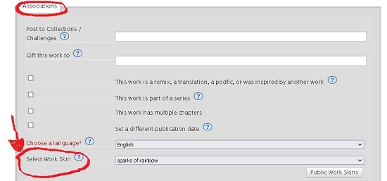
This passage is fundamental, because it will enable you to use the work skin on the whole work.
Now that the work skin is enabled, select "Edit" if the work has only one chapter, or “Edit chapter” for the chapter you want to apply the code to and in the section named "Chapter Text" (or "Work Text" is the work has only one chapter), select the HTML option instead of the “Rich text” option.
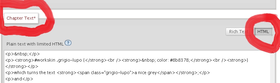
Now, to make your text underlined in pink with the code above, write this in HTML:
<span class="underlinepink">This is the text with pink underline.</span>
And this is the result:
This is the text with pink underline.
Nice, right?
You can find lists of HTML color codes here, here, here and here.
Here you can find another list of HTML colors, which also includes fluorescent colors and (just use the HTML code and don't mind the names, because they are the names of the crayons and don't work in the CSS).
Here you will find a sort of encyclopedia of HTML colors, with an amazing number of colors available.
You can also use this very helpful color picker, which will give you the HEX color code and also show you many other shades of the chosen color, each with the matching HEX code.
A small suggestion: I found that using the HEX color codes instead of the rgb codes is safer, as it's less likely to cause trouble when you use them in a workskin. If you find a rgb color you like, or if the code given by the gradient generator contains rgb codes instead of HEX codes, you can use this rgb to HEX converter to get the matching HEX code for each rgb code.
You can also change the color, style and thickness of the underline.
To add wavy underline like the waves of the ocean (I'm making it in color #00008B for the example), just write this in the CSS:
#workskin .waves {
text-decoration: underline;
text-decoration-color: #00008B;
text-decoration-style: wavy;
}
And when you write this in HTML:
<span class="waves">This is the text with wavy underline.</span>
The result is this:
This is the text with wavy underline.
If you add the line text-decoration-thickness to the code, you can make your underline thicker or thinner according to your personal preference, for example with this code:
#workskin .spessore {
text-decoration: underline;
text-decoration-color: #ffa500;
text-decoration-thickness: 5px;
}
You get this result:
This is the text with thick underline.
To make the underline dotted, you write this in the CSS:
#workskin .dotted {
text-decoration: underline;
text-decoration-color: #228B22;
text-decoration-style: dotted;
text-decoration-thickness: 5px;
}
And this is the result:
This is the text with dotted underline.
For a dashed underline, the code is this (I'm making it in color #ff0000 here):
#workskin .dashed {
text-decoration: underline;
text-decoration-color: #ff0000;
text-decoration-style: dashed;
text-decoration-thickness: 5px;
}
And the result is this:
This is the text with dashed underline.
And you can make a double underline with this code:
#workskin .double {
text-decoration: underline;
text-decoration-color: #6a006a;
text-decoration-style: double;
}
With this result:
This is the text with double underline.
But that's not all: you can also combine colored text with colored underline, so your underline will be the same color of your text.
How? Easy! Just write the code like this (I'm making the code use the green color #228B22 for this example):
#workskin .doublegreen {
color: #228B22;
text-decoration: underline;
text-decoration-color: #228B22;
text-decoration-thickness: 1px;
}
And once posted, it looks like this:
This is the colored text and colored underline combo.
And of course, you can use gradient text and mix it with colored underline. Let's say you want your text in a blue and green gradient with a dark blue (color #00008B) wavy underline, then you write this in the CSS:
#workskin .mare {
background: linear-gradient(to right, #9711fa 0%, #081c85 40%, #096979 70%, #00d4ff 80%, #081c85 100%);
-webkit-background-clip: text;
-webkit-text-fill-color: transparent;
text-decoration: underline;
text-decoration-color: #00008B;
text-decoration-style: wavy;
text-decoration-thickness: 1px;
}
And once posted, this is the result:
This is the sea gradient text with wavy blue underline.
You can create a gradient underline too, writing the code like this:
#workskin .under {
text-decoration: none;
border: 0;
border-bottom: 4px solid;
border-image: linear-gradient(90deg, #880E4F, #29B6F6) 1 stretch;
}
So when you write it like this in HTML:
<span class="under">THIS IS THE TEXT WITH GRADIENT UNDERLINE</span>
You get this result:
THIS IS THE TEXT WITH GRADIENT UNDERLINE
And you can make a combo of gradient text with a gradient underline, even in contrasting colors, just writing both codes ("cole" is the gradient underline and "joe" is the gradient text in this example):
#workskin .cole {
text-decoration: none;
border: 0;
border-bottom: 4px solid;
border-image: linear-gradient(to top right, #ffff00 0%, #FF0000 10%, #FF14E0 25%, #B833D3 42%, #28E2FF 60%, #248AFF 79%, #4006FF 90%, #00ff00 100%) 1 stretch;
}
#workskin .joe {
background: linear-gradient(to right, #9711fa 0%, #081c85 40%, #096979 70%, #00d4ff 100%);
-webkit-background-clip: text;
-webkit-text-fill-color: transparent;
}
Then you write it like this in HTML:
<span class="cole"><span class="joe">THIS IS THE COMBO GRADIENT TEXT WITH GRADIENT UNDERLINE</span></span>
And this is the result:
THIS IS THE COMBO GRADIENT TEXT WITH GRADIENT UNDERLINE
Next chapter is to create line dividers.