Chapter Text
...
"Why even make a map when he can just write an address? This is so pointless."
"Maps have other functions too, you know!" Hero explains, "there are other reasons why someone would make a map."
There are two types of maps:
Reference Maps and Thematic Maps
Reference Maps are maps that are used to show political locations such as cities, countries, regions, etc. These maps are often used as guides for travelling and location.
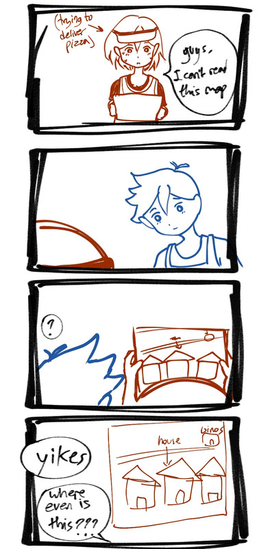
"—And an example would be the map that Cesar tried to draw to reference where I'm supposed to deliver the pizza."
"... Exactly!"
Thematic Maps are used to showcase data. 1 or more variables of a certain theme/topic are displayed on the map to show how it's distributed. These sorts of maps might show things like a country's population density, or how many of [x] is distributed throughout a region. The data could be represented through dots/shapes, colors/hues, or sizes.
"... Basically, a thematic map could show how many vending machines stocked with Orange Joe are in the state using a dot to represent one vending machine... though I think our town would probably be the only one with dots."
Moving on with map types, there are also several types of Thematic Maps:
Cartograms;
Cartograms show data by distorting the sizes of land mass.
"For instance, in a map about locations with more living populations, Nearby City has a huge resident count compared to Faraway Town, so the land area of Nearby City would be huge compared to our town," Hero said. "Below, there's also another example of a cartogram."

"India and China must have that many people living in there if the data makes them look that big."
Choropleth Maps;
These maps use color shades/hues to show data. Colors can show how the data varies among regions on the map.
Example: a map to show the world's density like the last one would use different shades to show which country has the most people living in it.
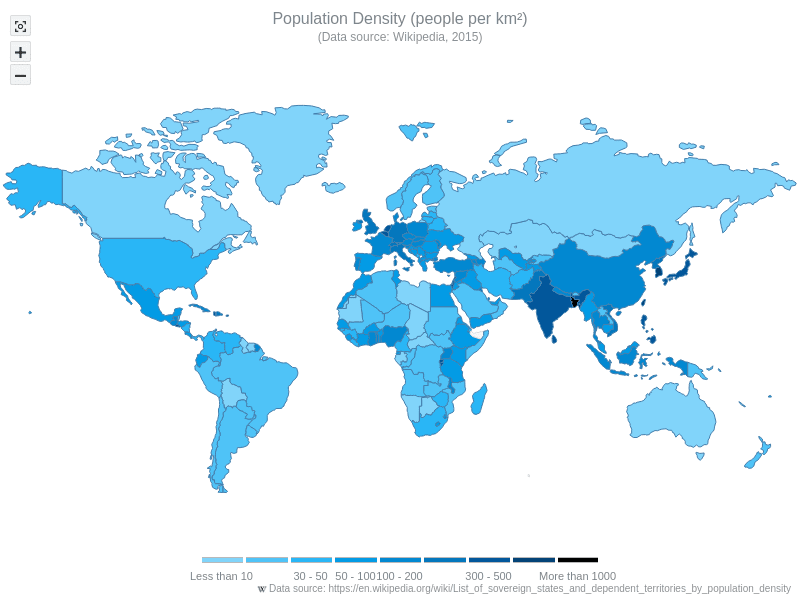
One way to remember this map is that "choro" means "land" and "pleth" means "fullness". So you gotta see how full the color is!
Dot Maps;
"Like I mentioned earlier when talking about Thematic Maps, an obvious example of a dot map would be that Orange Joe data. Each cluster of information would be represented by a dot."
"Oh hey, I found a dot map for the world population." Kel pulls out a map out of nowhere:
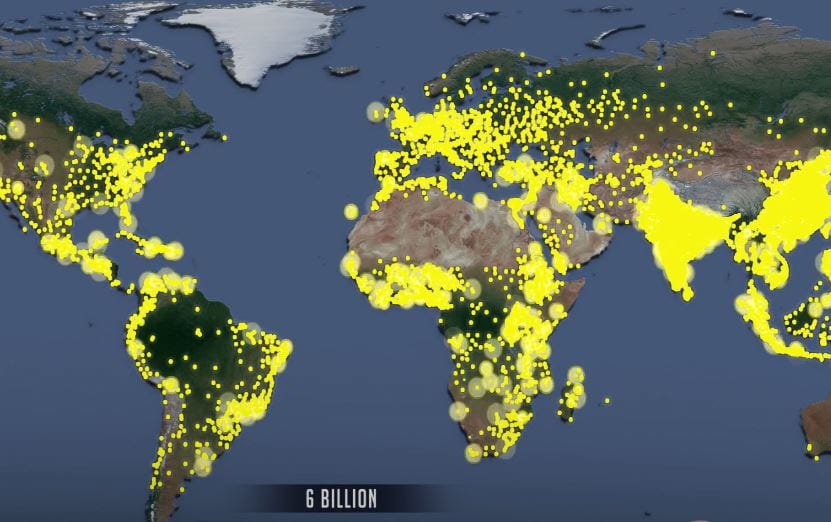
One way to remember this map is... well—"dot map" is pretty self-explanatory.
Graduated Symbol;
These maps use a certain symbol to represent a quantity or variable. Typically, the more abundant this quantity is, the larger the symbol gets.
"If we had a map of Faraway using graduated symbols to represent the houses with the biggest family, ours and Mikhael's house would probably have the biggest symbol," Kel thought to himself.
---Below is a map of the world's population using graduated symbols.
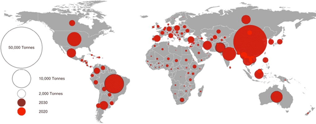
One way to remember these maps is by thinking; "graduated" as in "higher" which relates to the symbols being raised to a larger scale depending on the data.
Isoline Maps;
This map is a little iffy to explain (because I suck at writing), but it involves using lines to connect points of equal value. These maps are more often used to show elevation, temperature, or pressure. To better understand them, these are some examples.
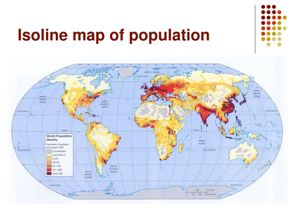

A way to remember this is "iso"="equal" and it has the word "line," so it means "equal lines."
***Maps also come in different sizes, or scales.
A Large Scale map will be more zoomed in to show a smaller section of a region.
A Small Scale map is zoomed out to show an entire country, or even all the continents.
Left is large scale while the right is small scale. Don't confuse them!
"Aaand... those should be the basics of map types."
"I don't even remember why we started talking about maps for half an hour—holy shit, I haven't even delivered the pizza yet?!" Kel yells, checking the time from the clock on the wall.
He shoots up, grabbing the forgotten pizza box—which is definitely cold by now—and sprints back into the kitchen to switch it for another pizza.
... In the end... he was still scolded for his lateness. Hey, at least he learned about maps?