Chapter Text
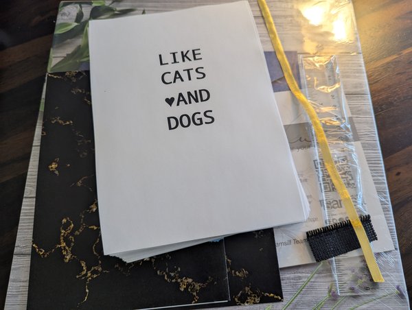
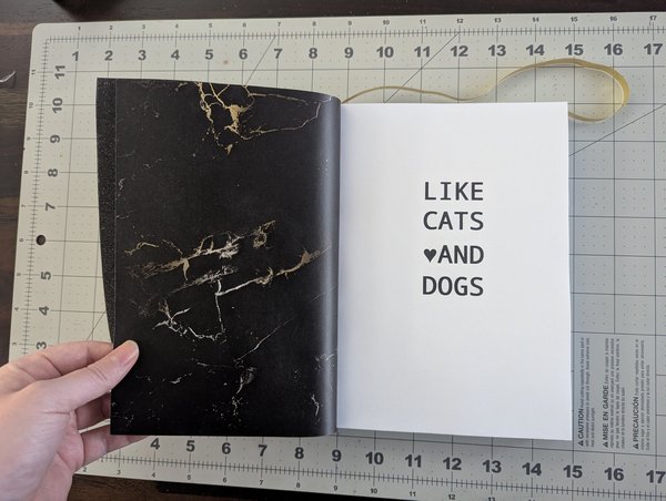
As some of you may already know, I wrote my first novel-length fanfic a while ago: Like Cats and Dogs (part 1 in the SuperDog and BatCat series, link above in this work's description 😜).
I admittedly got quite burnt out after writing it because I crammed all the brainstorming, writing, and editing into 2-3 months time. While "recovering" from writer's burnout by reading all your lovely comments, my brain turned to less computer-based hobbies and I picked up leathercrafting. I quickly made a silly little SuperBat Logo which now sits superglued to my phone before starting to look for larger projects.
That's when I discovered the lovely concept of binding your own books, sometimes even with leather, and my next craft-baby was born~!
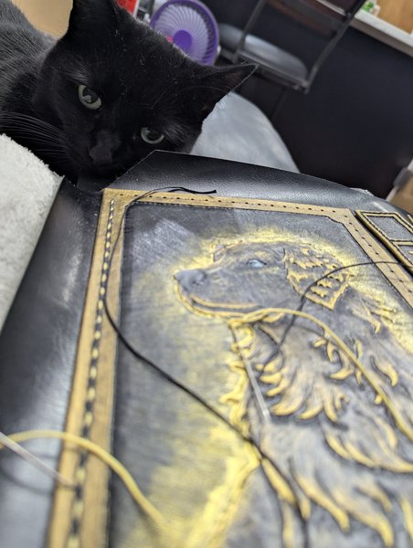
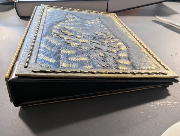
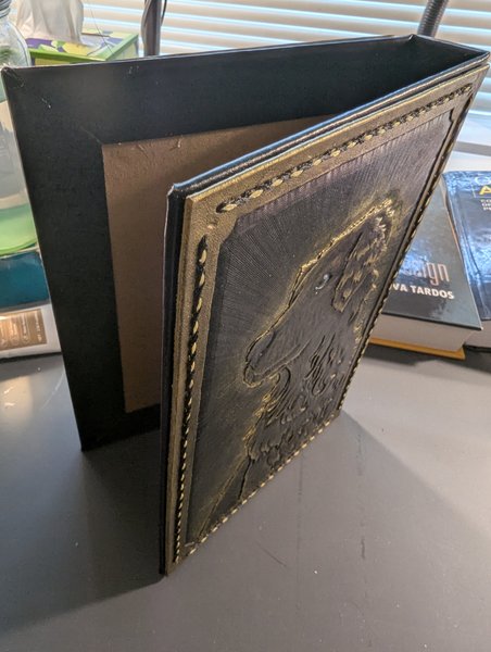
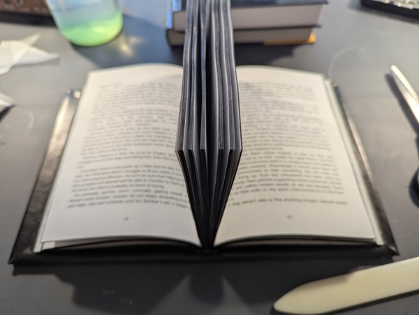
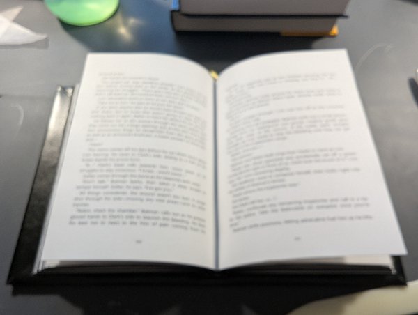
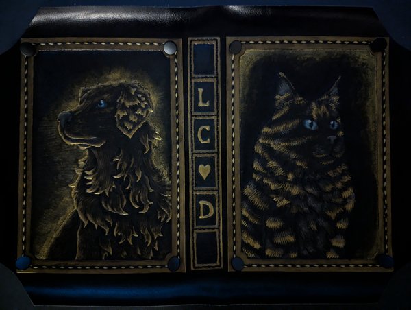
Without further ado, let's start with dessert and have a look at the finished product!
🎊🥳🎉🎊🥳🎉🎊🥳🎉🎊🥳🎉🎊🥳🎉🎊
🎊🥳🎉🎊🥳🎉🎊🥳🎉🎊🥳🎉🎊🥳🎉🎊
🎊🥳🎉🎊🥳🎉🎊🥳🎉🎊🥳🎉🎊🥳🎉🎊
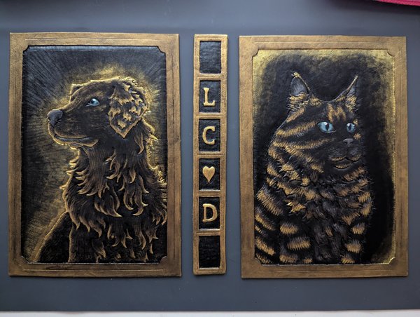
Note: Technically it was not actually finished when I took the video. I'm missing metal buttons in the 4 corners of the front and back covers, but shhhhhh this project took so damned long I couldn't wait anymore.
🎊🥳🎉🎊🥳🎉🎊🥳🎉🎊🥳🎉🎊🥳🎉🎊
Okay.
Holy Shit.
I made this video within hours of gluing all the final pieces together and I cannot express how AWESOME it felt to actually hold this thing in my hands after literal months of effort. Almost a full year if you count the original writing process for the fanfic itself. Up until this point, I had only been handling individual pieces of the project as I work on them, so feeling the literal weight of the completely assembled book is just divine.
But enough of that, you guys deserve more pictures too.
ALL OF THE PICTURES.
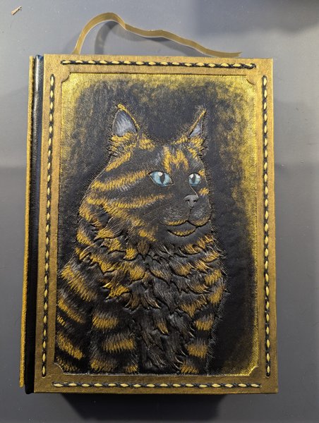
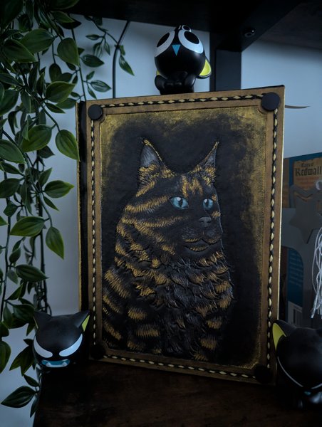
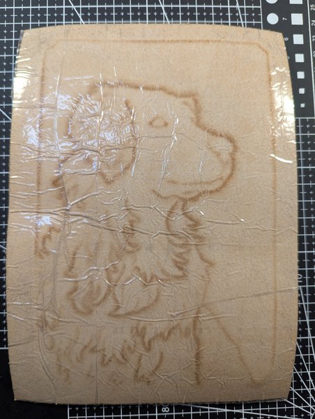
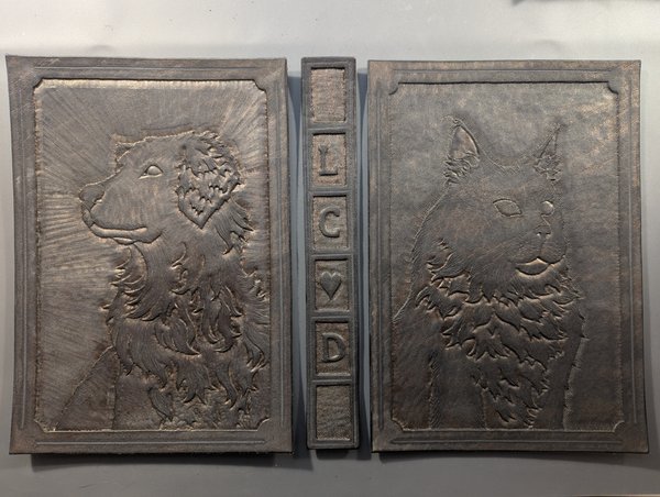
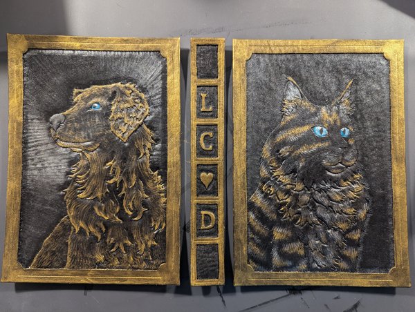
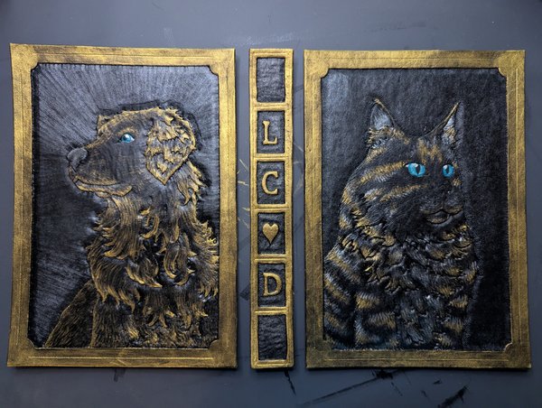
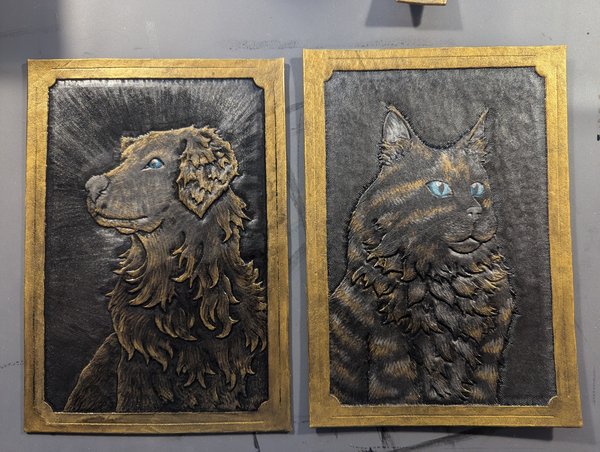
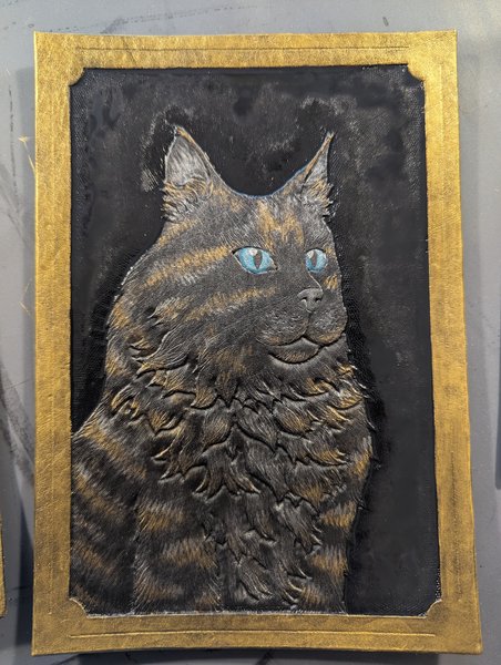
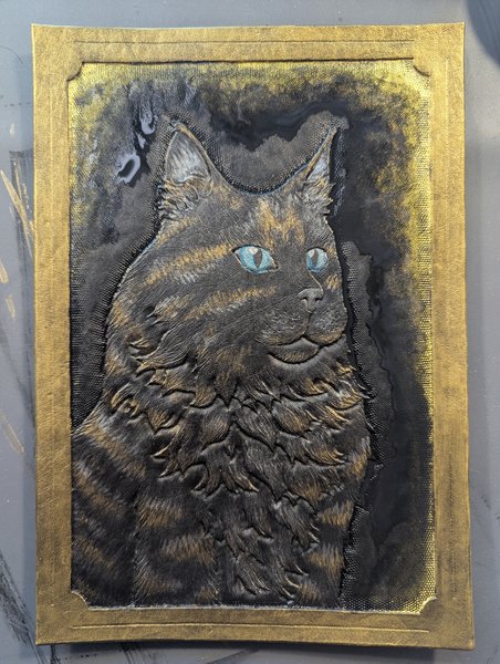
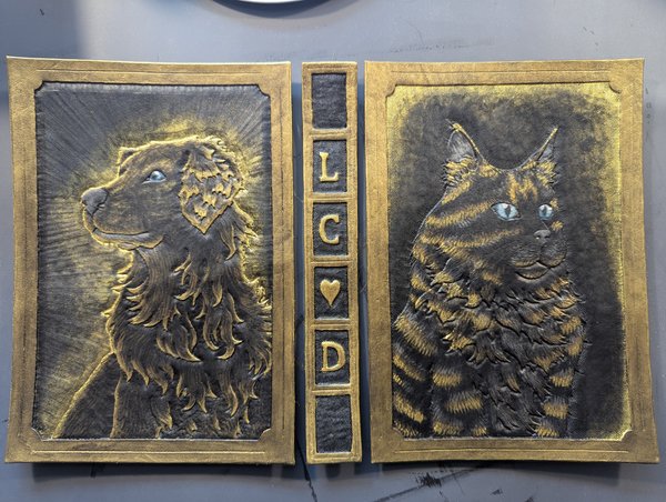
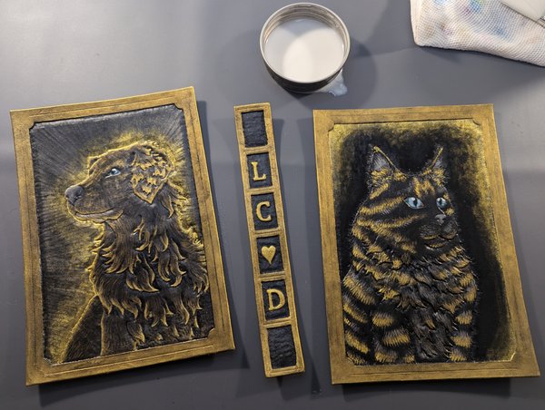
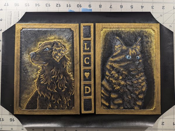
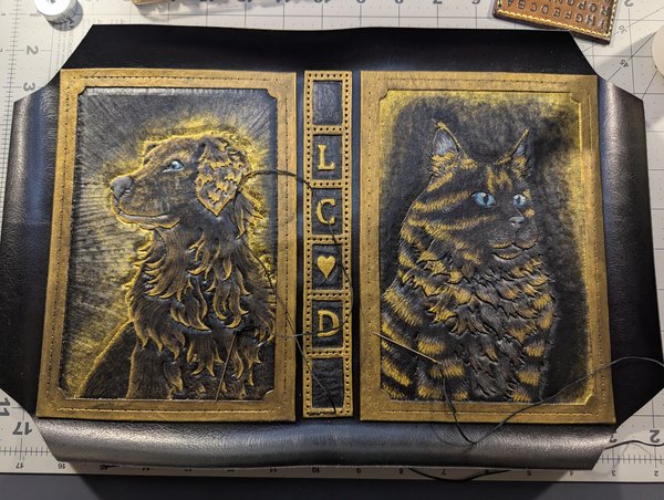
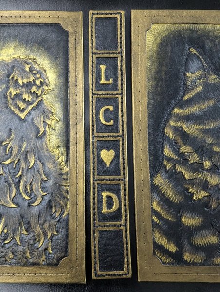
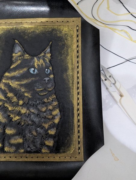
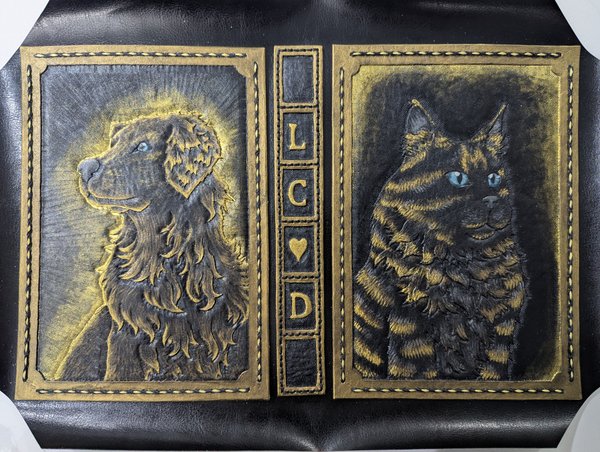
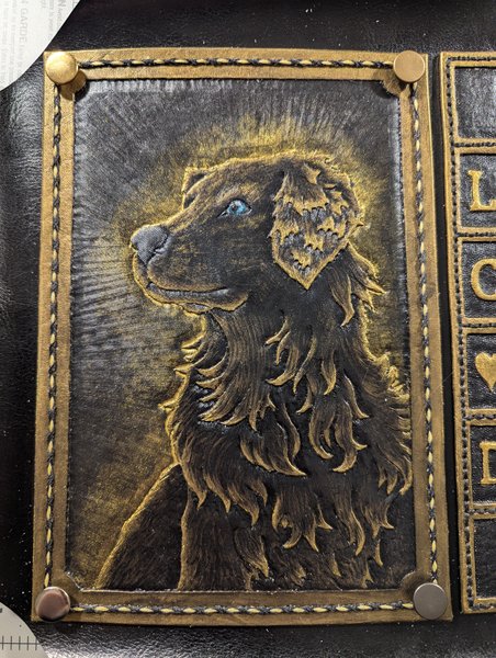
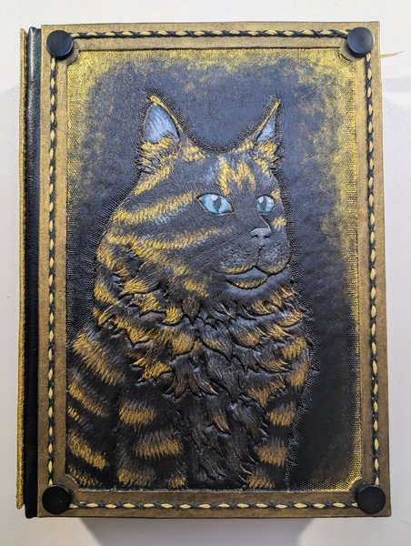
Front cover, featuring our beloved Spooky. I'll be honest he didn't really turn out as well as I had hoped. Not that he turned out badly at all! It's just... Uh... Krypto kind of stole the show on the back cover, lol.
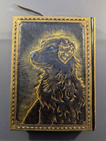
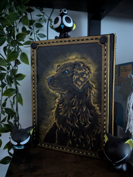
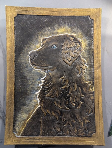
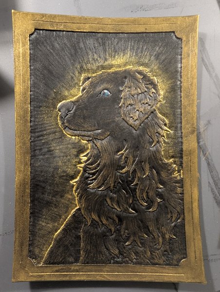
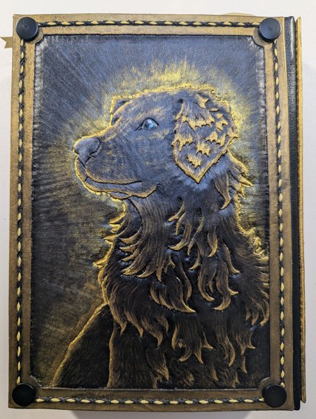
Back cover, featuring our bestest of boys, Krypto. Also a friendly reminder that this is the Golden Retriever ! Krypto unique to Like Cats and Dogs, not the scruffy white chaos fiend that is the more well-known Kryptonian Super-Dog.
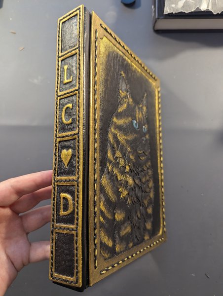
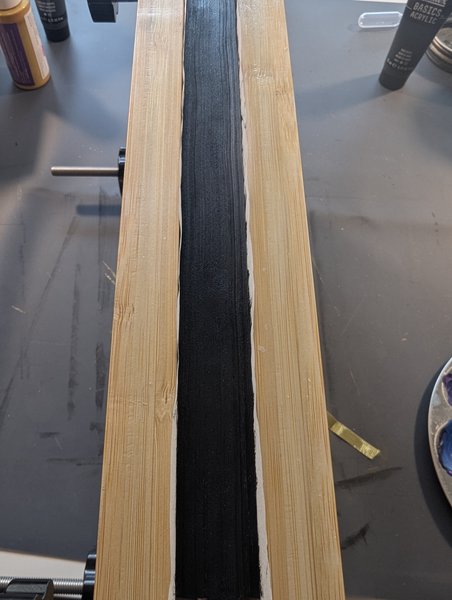
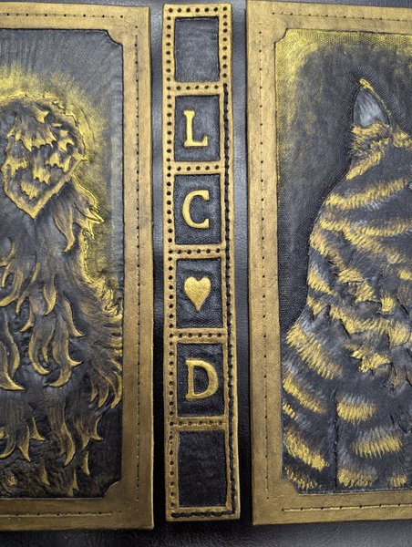
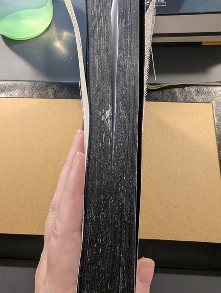
Book Spine with title acronym.
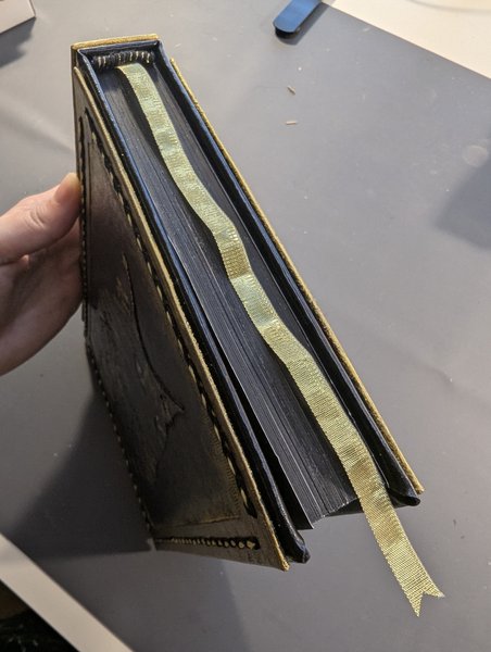
Bookmark ribbon.
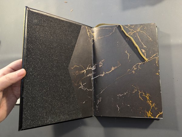
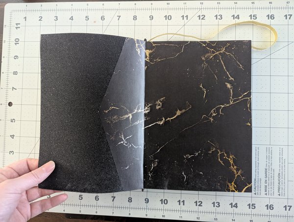
Fancy end papers... because I clearly have a problem doing anything "basic", I went ahead and glued two different types of paper together just to make this. More on that later.
Actually, speaking of "later", I guess it's time to dive in to the real meat of this post. For the next few chapters I'll be detailing all the steps I took to make this, including all the mistakes I made, lessons I learned, and things I would do differently next time.
As always, I would LOVE to hear from you guys in the comments. This is the first time I've ever done a bookbinding, so if you've got tips and tricks you could share, I'm all ears. Otherwise I'll do my best to tell you everything I've done, but I will inevitably miss some things so I can always clarify any questions you guys have!
Notes:
....where do people actually post their fandom/fanfic art anyways? I'm only really familiar with ao3 and discord when it comes to fandom spaces, but if I make a habit of these types of things I might consider creating a new account somewhere more appropriate.
Chapter 2: The Drawing Board
Notes:
Heads up but this chapter is more about how I chose the style of the project so it doesn't actually contain much in the way of my own project photos. It's more about the thought process and why I made the decisions I made, plus some references to real guides that you can look at if you want to do this yourself.
Starting from the next chapter it will be 100% all my own progress photos so hang tight til then (or skip this chapter if you're not interested, I won't be offended 😂)
Chapter Text
So like all good art projects, it started with an overachieving dream and absolutely no creative juices in sight. I knew I wanted to do a leatherbound book so I hit google and found lots of eye-opening tutorials. Considering I had never done any kind of bookbinding before--let alone leather bookbinding--it was completely overwhelming and I don't think I absorbed all that much of it. That "overwhelmed" feeling kept delaying the project over and over again until I eventually got high on ADHD meds and decided to go full YOLO and hit the ground running.
With that in mind I have no idea what guide(s) I actually did end up following in the end (I'll link what I can), mainly because in order to follow a guide you have to actually pick the style of book you want to bind and.... I had difficulties with that, to say the least.
Style #1 : Carved Covers, Blank Spine
First off was this guy, probably the top hit on google for a reason: https://www.instructables.com/Bind-a-Book-in-Tooled-Leather/

The main thing that stuck out to me about this one was that the leather cover was made up of two smaller pieces of carved leather, rather that a single blank piece that bends around the "text block" (all the glued/tied together pages of the actual book). I needed the multi-piece approach for a few reasons:
- I was honestly not sure I could do a fully carved cover all in one piece without screwing up. At least with three pieces (front, back, and spine) I could always throw one of them out and replace them if I messed up.
- With smaller pieces, I had more options for actually buying the leather and was able to get a cheaper price than if I did a single piece.
- A lot of the guides for the single piece option involved more complex techniques to help get the thicker leather to actually bend when opening/closing the book, and that was another very risky element that could potentially ruin the whole project if I messed up.
That being said, I honestly wasn't a fan of the spine; I wanted a spine that was the same material as the covers called "vegetable tanned leather" that you can carve, not something blank made out of thinner "chrome tanned leather" that you often see in more flexible projects like clothing or purses. This design also had to sacrifice some space on the covers to be covered up by the more flexible spine leather and I didn't want that either.
While I didn't end up following this tutorial specifically, I did take elements of it to use for myself, namely:
- Making the front and back covers individually and assembling them later.
- Using some sort of thin flexible leather to fill the gaps and allow better mobility.
Style #2 : Carved Covers and Spine
I didn't find this style until AFTER I had already started buying and prepping the leather, so it was too late to change, but I still felt it's worth mentioning. Considering how long it took me to find an image of it again while I write this, it's no wonder I didn't find it sooner, it's a really uncommon style but I still love how it looks and if I do another book again in the future I would love to try it. Maybe it would work well for some type of journal?

Source: https://pin.it/3XqanRfCT (I'm sorry I don't know where this originally came from x.x)
So basically the style here is to still have the three pieces like I wanted (front, back, and spine) but to craft the spine out of a thinner (but still carvable) piece of leather and then stitch the pieces together. This probably wouldn't have been as bendy as the route I ended up taking, but it was better than a single piece of leather and it looks so damned cool anyways???
Now for some confessions: I actually loved this style so much that as I got farther in the process of making this book, I started to feel like I regretted my original design. That regret manifested in some anxiety and it often prevented me from working on this book at all. In fact, the closer I got to finishing the book the more I felt like I had made some sort of mistake that would ruin it (ahem foreshadowing) and the harder it got to just sit down and do it already.
Off-topic medical rant, no trigger warnings apply but totally skippable, click to enable the distraction.
To make matters worse I had some medical issues with my current set of prescriptions, one of which is a very strong stimulant for ADHD, and my heartrate was doing some very weird things that shouldn't be happening outside of cheesy romance novels. You know, "skipping a beat", hearing or feeling your heart beat in your chest, etcetcetc. There are also signs that my liver isn't having the greatest of times cause of all the meds I'm taking (some for ADHD, some for a really annoying thing called lipoprotein(a) (read: lipoprotien 'little a')). All the things that kind of freaked my docter out a bit. She's so sweet about it all but I swear she gets more concerned about my medical issues than I do. I'm choosing to ignore the implications of that and will continue to let her shoulder that anxiety for me.
ANYWAYS, they had to temporarily reduce my ADHD meds which kind of... Uh... Stalled life in general. I forgot how ineffective my brain could be without medication, and I also learned that my front hallway can hold up to 3 full garbage bags and a 3 foot stack of broken down amazon boxes before I finally find enough motivation to deal with it. Jesus christ, brain, get your shit together plzkthx.
But turns out everything was fine so a few weeks ago my doc finally put me back on my normal ADHD meds. My front hallway is clear, my liver still isn't happy but it hasn't totally crapped out on me yet, and I managed to finish the book! Yay!
Anxiety problems aside, if you've seen the first chapter then you already know how this ends: I finished the book and I didn't regret it at all! In fact, I'm glad I didn't let my anxiety win. Everything turned out just fine and in some ways turned out even better than I was expecting. So if you take away anything from this whole thing, it's that you need to trust the process!
Style #3 : Carved leather "sleeve" over a separately bound book
Okay so this was the last style I considered and I almost went through with it. There's a music/ASMR speed run on youtube called Crafting The ULTIMATE Leather Book Cover by Kingdom Glory Leather that I highly recommend if you're interested in how leather carving actually works when you know what you're doing (because I do NOT know what I'm doing, lol). The only thing that stopped me was that I felt like a cover like this might have come across too "bulky", especially since my story was only around ~80k words and wasn't supposed to be all that big. I also am not good enough with leather or other hands-on crafts to be as precise as he was with his measurements, adding to the risk of bulking up too much.
If you don't watch the video, the key take aways are that a single piece of carved leather is made, then on the inside of the leather you sew on the "pockets" with a thinner leather. These pockets allow you to slip the leather cover onto the book similar to how a store-bought hardcover book has those paper sleeves hooked around the covers.
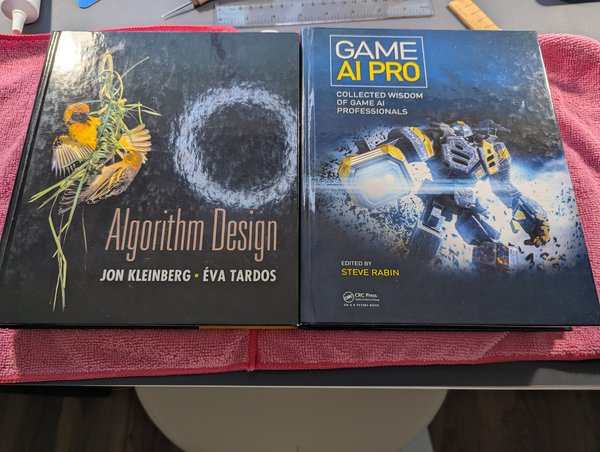
The main difference between this style and the first two is that for this one I would have to bind the book itself separately using more standard bookbinding techniques, aka making the covers and spine out of pieces of chipboard that you then glue some "book fabric" over top, like so (wikihow source for simplicity and pictures, not necessarilty the quality of tutorial).
Which Style Won?!
None of them. I made my own which kind of blended them all together.
....Remember how I started off this chapter by complaining I was overwhelmed and anxious about never having done any of this before? Well, apparently my solution to that was to actively create new sources of anxiety for myself by going off script right from day one.
😅
So if you're not following a script, just make up your own. In this case, the main things I decided on were:
- A full leather cover permanently glued/bound directly onto a text block (as in style #1)
- Three carved pieces of leather (similar to style #2)
- A regular bound book with chipboard and everything "normal" (as in style #3) EXCEPT instead of make the leather "slip" onto the regular bound book, I stitched the carved leather directly onto the book fabric before gluing that book fabric to the chipboard.
Chapter 3: The "Text Block"
Notes:
This first half of this chapter is explanation heavy, but the second half is a huge photo dump, and we end off with a "material costs" table at the end that I'll update at the end of any chapter where I buy new materials.
Read/scroll at your leisure.
(See the end of the chapter for more notes.)
Chapter Text
With a style in mind, I then had two major things to do:
- Print out the "text block"
- Make the cover
Sounds simple enough, right?
Wrong.
Oh gods was I wrong.
I knew the cover itself was going to be complex and daunting because of all the leatherworking required. I was prepared for that. I was anxious, but I was ready, you know? But before I could start on the cover, I needed to know what dimensions the covers and spine needed to be, but in order to know that, I needed to make the actual "text block" itself.
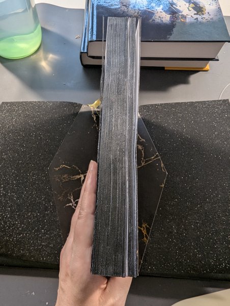
For those unaware, the text block is the stack of papers bound together to make the actual book itself. As far as I'm aware, there are two main ways someone can create a text block:
- "Perfect Binding" Method: Print each page doublesided on their own individual piece of paper in the exact paper size you want, stack them in reading order, then apply glue to the side of the stack until it's sturdy enough to hold together.
Note: The method name is literally "Perfect Binding", not that anyone is saying "This binding method is perfect". As we will see shortly, it is clearly not perfect (though more from my own errors than the method itself, but shhhhh I'm gonna shift some blame here to make myself feel better) - Casebinding Method: Print out the pages on paper twice the width you want your book pages to be, with each piece of paper showing four "pages". Arrange these pages into smaller groups of 5-10 pieces of paper (and hope to god you printing the pages in the correct order) called "signatures". Fold each signature in half, poke holes in the pretty pages, sew the pages together tight enough to keep them in place but not so tight that you tear the paper cause it's still flimsy-ass paper you're working with, arrange all signatures in a stack, sew those stacks together, then apply glue to the stitches anyways. Then you have to decide whether you want to try cutting through that entire stack of paper with the sharpest knife you've ever held and hope you don't cut off too much, or you have to come to terms with the fact that your book's edge will have a trippy jagged wave to it.
...can you tell I'm a little biased and intimidated? lol
If my writing style didn't make it clear enough, I fell for the "perfect" marketing and was lured into a false sense of security, chosing to go with the former option. In all fairness it was probably still the better choice for me because it was far fewer steps, but there were some odd complexities to it that I hadn't anticipated.
Complexity #0 : Buying Paper
Before we get started: Yes, I know, I'm starting at 0 instead of 1. Why? Because I'm a programmer at heart, programmers are weird, and honestly I didn't even think this would have been a "complexity" to begin with and I had already started writing about Complexity #1 before I remembered the hell that was "buying paper". Or just "paper" in general.
So why is paper a problem? Because apparently "size" isn't the only thing you have to decide on when buying paper. You have to consider all of the following:
Weight
Measured in either pounds (lbs) or gsm. When shopping I had a tab open to pounds<->gsm conversion charts and I cross referenced it constantly.
Did you know that even if two brands of paper are listed as "70lbs" they could still be different thicknesses? I didn't. Just in case you thought the inconsistencies of Freedom Units wasn't already enough, apparently in the world of paper, there's a difference between being "70lbs text" and "70lbs cover". Rude.
Either way, I went with 24lbs text, which is slightly thicker than the more common "standard printer paper" which is 20lbs text. Overall this made the paper more expensive, but I really wanted the heavier paper because it's harder to see through and it also helps give the book more overall thickness, which helps reduce the "bulky" look of the leather. The last thing I wanted was to make a book that was more "cover" than actual "book", lol.
Dimensions (aka size)
You need to learn the difference between things like A4, A5, Letter, Legal, etc.
One of my mistakes (which was thankfully inconsequential) was that Letter is NOT the same size as A4.
One of my OTHER mistakes was realizing that there's a difference between paper that's 5"x7" and paper that's 7"x5". No, the problem isn't fixed just by rotating the page 90 degrees. Why? Cause it has to do with something called the "grain".
Grain
Yes, "grain" as in "wood grain", though it's more like "pulp grain". Paper is made by compressing water-logged pulp particles together until all the water is squeezed out and you're left with a soggy sheet. In a commersial setting, when this happens their machines will make the pulp settle in such a way that the grains arrange themselves parallel to each other. Whether they are parallel to the longest or shortest side of the page is then considered to be the "grain direction".
If you were following along in the "dimensions" section, this is where 5"x7" vs 7"x5" comes in: Supposedly the first number listed is supposed to indicate the grain direction, so in 5"x7", the 5 is listed first which is the short side of the page, therefore the grain is parallel to the short side of the page, aka the paper is short grain. Only problem with this is that it's apparently not a standard practice, so grain can be a bit of a guessing game if you don't already have a sample piece to test which direction it bends best.
But why does this event matter? Because apparently the grain direction can affect how easily your pages bend in a certain direction. In general, your finished pages should be "long-grain", as in "the pulp is parallel to the longest side of the page", making it easier for your pages to bend and settle properly when you open the book.
But don't forget! Depending on your binding method, your will have to buy different grain directions depending on whether you fold your paper into signatures or not.
...I definitely forgot that part, though it's not too visible in the final product.
Texture
The only reason I'm even mentioning this one is cause I totally didn't think about it when ordering my paper and ended up buying a type that was suuuuper smooth. Generally speaking you don't want super smooth paper cause it's hard to create enough friction to properly flip the pages while reading.
Price/Availability
Apparently the type of paper I wanted was considered "premium" because I was trying to avoid pages being so thin you could see through them. This made it hard to find and I didn't want to drive around town looking for it, so I just found what I could get on amazon and probably paid too much for it in general. Next time I'll get cheaper paper and test it out on a smaller book, or buy a larger size (which is more common/available) and then go with the folded signatures binding method.
Complexity #1 : Creating a PDF
Once you have your paper ready, you're able to print!
Lol, as if.
Turning an online text-based "book" into a fully formatted PDF was a problem I never truly respected until I was faced with having to do it at all.
Thank god I had already been introduced to a wonderful product called Scrivener. It may trigger Windows '95 flashbacks due to it's UI looking like it came straight out of the '90s tech boom, but the absolutely VAST amount of features this product is capable of is truly awe-inspiring. One very specific feature is the ability to export your book into a variety of custom formats suitable for PDF export. It will take your plain text and automatically format it with chapter titles, margins, page numbers, page breaks, title pages, credits pages, etcetcetc. It takes a while to get used to all the settings and to experiment with what you want, but once you get started it's easy to tweak to your liking. I think I exported this book to PDF at least 10 times, each time changing a small setting like font size or chapter title spacing in order to settle on a total page count within the range I wanted.
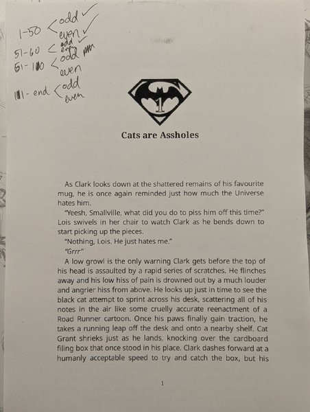
Once I got the hang of it I spent some extra time drawing my own chapter number icons. I took a picture of my SuperBat pin and used an online drawing program to trace out the "bat icon". Once I had that outline done and saved, I added a text number to it for the numbers 1-32 and created 32 different image files for it. With that set of manual copying done, the Scrivener side of things was much more automatic as you're allowed to use variables like "chapter number" throughout the export format.
Note: If this logo and text looks pixelated to you... it's because it is. Keep on reading.
So with my chapters all automatically arranged for me AND with my printer paper loaded up and ready to go, it's time to print it out!
Easy, right?
Lol.
I have a computing science degree and I am not religious, but I am a firm believer that printers were sent to us from hell.
My printer has a "print double-sided" checkbox. The problem? It doesn't actually work. It literally does NOTHING different than if it weren't checked. Why? Because apparently that feature only exists for Letter size printer paper. My book is set to use A5 paper. Guess I'm doing this shit manually myself.
After a lot of trial and error, I managed to find out the correct "instructions" to manually print out double sided pages. I even ended up using some of my scrap tester pieces to try and track my progress because I couldn't print everything at once.
As for the actually instructions and process, it was far more complicated than it deserved to be and involved things like:
- Figure out how to get your printer to print out odd pages only.... Mine didn't have this feature either, so I had to use PDF splicing tools to create NEW PDFs with only the odd or even numbered pages
- Figure out how to get your printer to print out BACKWARDS otherwise you'll have to manually reverse the page order when you feed it back into the printer to print the opposite side.... Mine didn't have this feature either. Back to PDF splicing.
- Once printed, pick up the stack, flip it over FROM SIDE TO SIDE. I found out the hard way that flipping vertically gives different results.
- Print again, but this time only the odd pages. BUT WAIT don't forget to add a blank page to the stack depending on whether your book has a total page count of odd or even numbers. I would explain why, but I'm out of mental energy for this fuckery.
- Once you've finished printing the first batch of pages, promptly realize that the text is all pixelated, your paper smells burnt, and your printer has gone on strike and refuses to print the next batch.
- Spend 2 hours swearing at your printer and following all the tech support tips until you eventually just reinstall everything and realize your printer is a lying little asshole who WASNT up to date on it's drivers despite telling you it was.
- Reprint the first batch again to excitedly realize that the pixelated text was actually fixed by the new drivers! Yay!
- ....Realize that you have a toxic relationship with your printer because your story about how you felt overjoyed when it gave you the bare minimum cooperation after hours of psychological torture sounds a little too similar to those "How to Recognize an Abusive Partner" safety videos.
- Ignore the problem and finish printing out your book, confident that "it's not like that" and "he didn't mean it" and "it won't happen again".
- Realize that you forgot to check the "low heat" option on your printer (if that option even works in the first place) and your pages come out wonky and a little burnt in places because you "overworked" your printer and he's a bit of a petty asshole.
- At the same time, realize too late that the new driver also came with new options like "print even/odd pages only" and "print in reverse order".
- Walk away from the printer with your loose "text block" and refuse to admit that steps #10 and #11 exist.
If you're curious about the difference that driver made on the pixellation.... Here's a before and after.
Complexity #2 : Text Block Accessories
So congrats, you've got a large stack of loose papers!
Sadly that's not all that you need to make a text block. You also want to have:
- End pages. These are basically the fancy coloured pages you see at the start and ends of a book that are actually glued directly to the cover.
- Book binding glue. Sometimes you can also use Elmer's Glue (aka "school glue"), but more dedicated glues help increase adhesion while maintaining flexibility as you bend the spine.
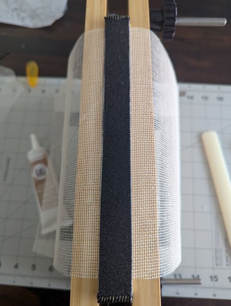
- Mull (aka super). Essentially this is a glorified type of cheese cloth with extra stiffening products applied to it. This is attached when gluing the spine to help provide more support (cause paper alone isn't exactly sturdy). I case you didn't know, in many binding styles, the spine of the text block isn't actually glued to the spine cover, meaning the only thing keeping your text block stuck to the cover are the end pages and this reinforced cheese cloth. So... Use mull!
- Headbands. These are pieces of fabric that you see poking up out of the tops and bottoms of the text block. While these may look like they're just for show, they actually help protect the cover from damage when people hook their fingers over the spine cover and pull books off shelves.
- Optional: Ribbon. Totally optional, but having a built in bookmark never hurts, right?
Most of these shouldn't be too hard to assemble. Look, here they all are now!
Ahhh the powers of editing and the illusion of success.
Who are we kidding, things haven't gone smoothly so far, so why should they do so now?
The ribbon wasn't too problematic as long as you ignore the fact that I had to return the first two types I purchased online because clearly no one else in the world understands what "gold" actually looks like (no, amazon, "metallic cream" doesn't count). I ended up just buying some at the craft store when I inevitably went to go find end papers.
The "headbands" were actually pretty zen to make, but unfortunately I didn't take any photos of the process so you'll just have to zoom in on the bottom right to see it. I basically just took stiff fabric I had left over from cross stitching, then I looped black and gold embroidery thread over it until you couldn't see the fabric anymore.
The chipboard (aka the boards used that put the "hard" into "hardcover") was a thankfully simple purchase. Small wins.
The end pages though?
Fuck the end pages.
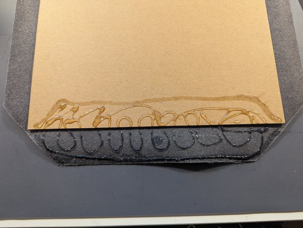
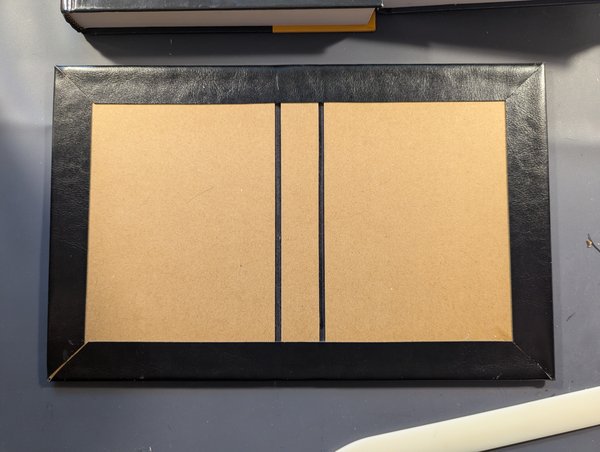
For the life of me I couldn't find appropriately sized end pages to save my life. In the end I was forced to buy two different types of fancy paper--one was black and glittery, the other was marbled gold on black--then cutting and gluing them together to make the size and shape I wanted.
After copious amounts of measuring and fretting, I finally glued them together and got something really pretty! See!
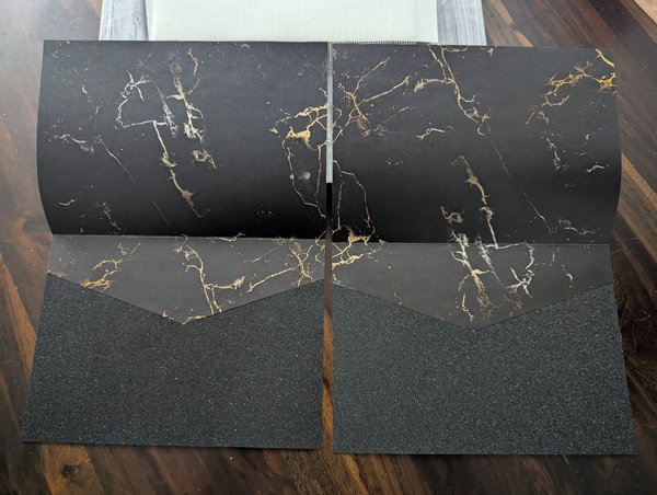
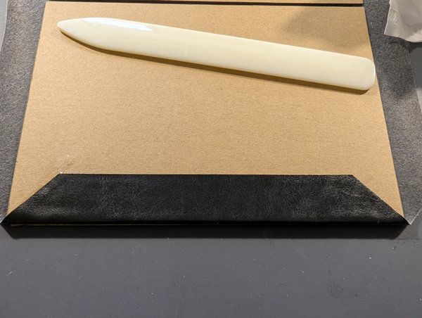
Except I totally lied. This was actually my SECOND attempt at making these pages. I made the first ones but kept the pages under a bit of weight until the glue fully dried. Apparently the pages were porous enough that the glue seeped through the paper and ended up glueing the folded pages together completely.
After a depressing trip BACK to the craft store (and an all-too-knowing look of pity from the cashier who knew exactly what it meant to have a customer come back and make a repeat purchase) and some lessons learned, I let these pages dry without any extra pressure after I had thoroughly smoothed the glue down until it cured enough to hold on its own.
Complexity #3 : Glue! Fumes!
Okay, despite the rest of this gong show so far, this part wasn't all that bad. The only problem was that the glue I bought smelled HORRIBLE. I literally had to wear a mask and hold my breath or else the chemical fumes gave me headaches. I swear all the stereotypes about artists being crazy are true solely because they are huffing chemical fumes far too often.
But thankfully I took lots of photos during these stages so here we go! A good ol' play-by-play re-enactment, now with 100% less harmful fumes!
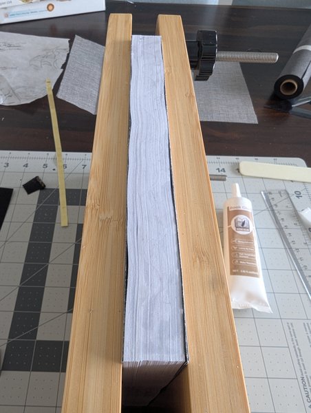
Step 1: Spend hours trying to arrange your stack of papers into a neat and compressed stack inside a press. Don't forget to fail miserably because your pages are already heat damaged and you're fresh out of patience.
Step 2: Apply a THIN layer of smelly glue and let it mostly dry! Don't let it dry completely because you will end up using the remaining tackiness to adhere to your next layer.
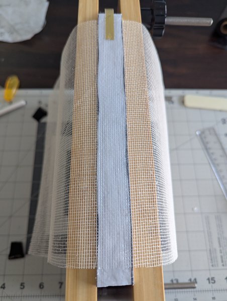
Step 3: Alternate between one of your "text block accessories" and, you guessed it, ANOTHER thin layer of smelly glue! In my case I added the ribbon first, then the "mull".
Step 4: Headbands! (...and glue)
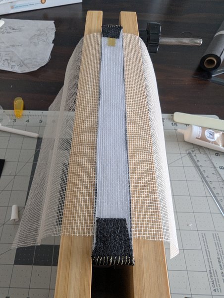
Step 5: Structural paper! (...aka left over glittery cardstock just to keep all the other layers strong)
Voila! All done with the text block!
And, of course, pictures for those not wanting to play videos:
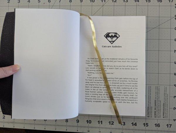
You may notice that the ribbon is significantly longer than in the final product... That's because something happened to it (no idea what... probably cat-related) and it got a bit damaged halfway down so I trimmed it.
Also the mull is much large than it should be, but I cut it down to size later on when attaching the cover.
For now the text block is done, the edge painting comes much later, so for now it's off to do the leather covers!
Cost Breakdown (running totals)
| Item | Total Price (CAD) | Adjusted for Amount Used |
| Scrivener (after free trial) | $100 | One-time purchase |
| Paper (A5, premium, 24lb text) | $45 | $45 (all of it...) |
| End papers | $15 | $5 |
| Mull | $16 | $1 |
| Book Glue | $18 | $2 |
| Ribbon | $10 | <$1 |
Disclaimer: The A5 paper was far more expensive than it needed to be, it could easily have been half that if I made "better" choices. Also I'm adding the total spending costs for anything I bought for this project, even if it wasn't consumed completely in the process. This helps me track "money I spent to do this without guaranteeing I even use the remaining materials" from "how much does this one book actually cost"
Hours spent crafting:
+1 for the gluing
+1 for miscellaneous other cutting/gluing/sewing for end pages, headbands, etc
+2 for PDF prep (most of this was actually me experimenting with scrivener export options, if I already had a style in mind it would have been minutes, not hours)
+3 for printing (most of this was me supervising my printer, issuing commands, loading various pdfs, etc; could have been lower if my printer wasn't manufactured in hell...)
Running Total: 7
Note: This is a rough time estimate of active time spent crafting and excludes time spent on researching how to do any of this shit, driving around buying supplies, spiralling in anxious turmoil, swearing at printers, troubleshooting my life's poor decisions, and generally overthinking every part of this project.
Notes:
K this is the final chapter for tonight so I'll post more tomorrow hopefully. I don't know how many chapters in total, but we've still got to cover: carving the leather, painting the leather, assembling the cover, assembling the book.
Chapter 4: The Leather Sculpting
Notes:
Finally! It's all about the pictures from here on out!!
Chapter Text
The Cover Art
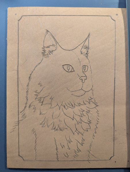
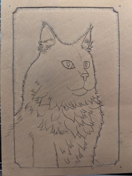
So with the decision made to have three pieces of leather (front, back, spine), it was time to pick out the design. I'm not super great at drawing people, and even if I was it's really hard to sculpt details like that into leather, so I went for something simple: Spooky the Cat on the front since the story starts mostly with Spooky, then Krypto the Dog on the back because the last few chapters are mostly about our bestest of boys.
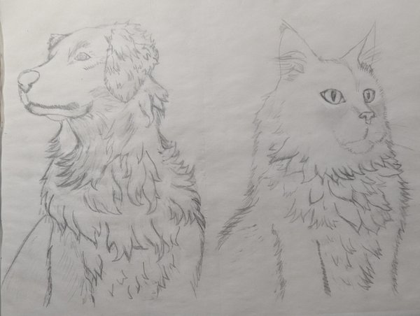
I looked around and eventually found these images on pinterest. Unfortunately there's no credit source and I can't guarantee it's not AI, but here they are for reference:
Once I had the reference pics ready, I printed them out, then traced their rough outline onto some tracing paper. I probably could have also traced using a tablet and a locked screen, but I didn't want to mess around with trying to guess at sizes and possibly rearranging the tracing paper. With a printout I was able to print as if it were A4 paper, making the two images both slightly smaller than size A5 paper, which is the page size of my book.
After the initial trace was done, I went back and tried to "cartoonify" the tuffs of fur into more blocky shapes. The blockier the shape, the easier it is to sculpt.
Prepping the Leather
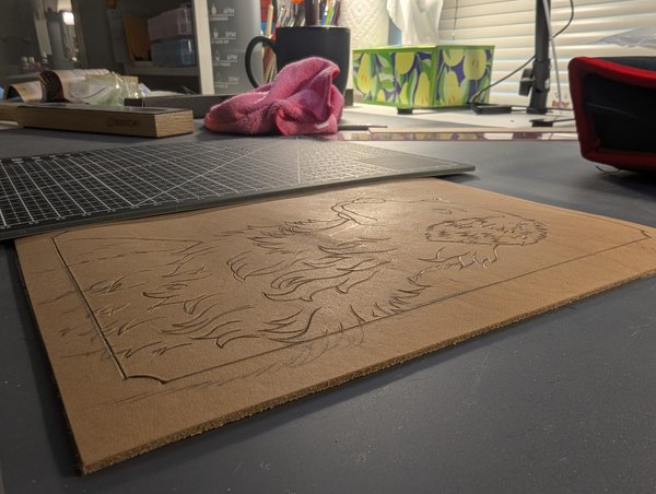
Once the main characters were all traced out, it was time to transfer the image to the leather. And for the record, for the couple weeks leading up to this point, the leather I originally bought as a roll has been sitting underneath all my fancy university-approved paperweights in at attempt to get it flattened out.
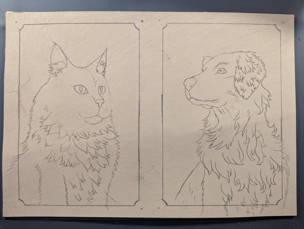
Anyways, once the leather was flattened out, I cut out a single piece that would eventually be both the front and back cover, then used graphite transfer paper to trace the designs directly onto the leather.
Now, a few things to note here:
- I kept the front and back cover "connected" because the leather sculpting process involves a lot of water and hammering, both of which tend to cause leather to warp and curl. One way to reduce that warping is to line the back of the leather with tape (which I also did) and to actually work with pieces of leather larger than your end product will be.
- Transfering images onto leather using graphite transfer paper is not generally recommended because you can't actually erase graphite from leather. Once it's on there, it's there to stay. In fact, you can even see where I tried to erase the lines that were sitting outside the border and they didn't really fade all that much. In my case, however, none of this matters because I'm going to be painting it all black anyways.
- I promptly forgot about point #1 and ended up cutting them apart fairly early on in this process.
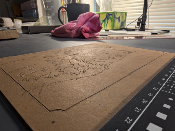
Either way, now that the image is on the leather, it's time to trace it all once again, but this time with a special knife!
(you can't really see it that easily in these photos but.... I'm adding them anyways for completeness)
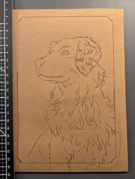
Maybe it's easier to see at an angle? For the most part you can't actually see the graphite much at this angle, especially in the sun's reflection, so any lines you see there are actually cause by the knive groove I just cut into it.
For those who noticed a colour difference: this is because I added water! Lots and lots of water! Holy smokes so much water! The leather was soooo thirsty it just kept absorbing it all, which is what you want it to do in general, but it was absorbing so much more than I was used to. Last time I worked with leather, I bought from a different company, so my guess is that whoever I bought from this time has a different process for making their leather than caused theirs to be more absorbant.
For now it doesn't seem like a big deal, but the more I worked with the leather the more I realized I had accidentally overcompensated and added too much water, making the stampings less pronounced than intended. I also found out much later on in the dying process that the leather soaks up dye just as readily as the water, creating a horrible effect which... We'll get to later.
Next time I don't think I'll end up buying from the same seller, but for now I can work with this, so...
On to the stamping!
In order to imprint images and textures into leather, you have to use specialty metal "stamps" and a mallet. With lots of hammering you eventually start to imprint designs onto the leather itself.
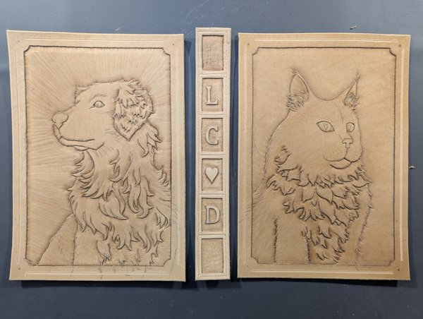
Sculpting Spooky
First up is tracing the background area with a simple dotted bevel stamp. The idea here is that the more texture there is, the more easily paint will be able to settle into the dots and increase the implication of shadows or fading.
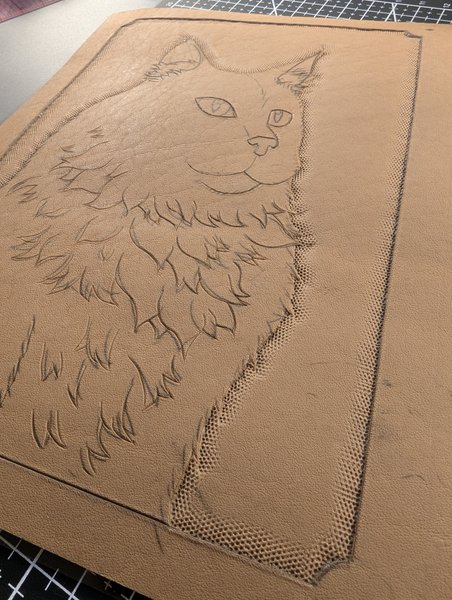
Here's what it looks like dried about from above, the 'shading' makes the image pop a little bit more.
Continuing to bevel, but this time around all the individual tufts of fur...
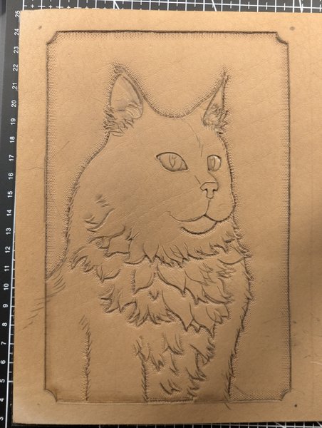
This next part is a bit more subtle, but essentially I went into all the fur and tried to deepen the areas to try and make the fur pop out more.
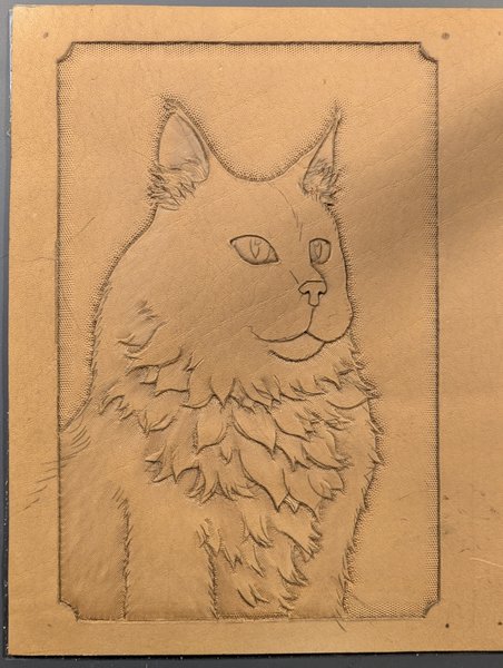
It was about this time that I was getting really frustrated with how the leather was behaving because none of the stamps were coming across as sharply as I was used to. I realized I was actually oversaturating the leather with water, causing it to "bounce back" after I hammered in a stamp. To fix this I essentially left this piece to dry out as much as possible over the new few days and instead starting working on Krypto while I waited.
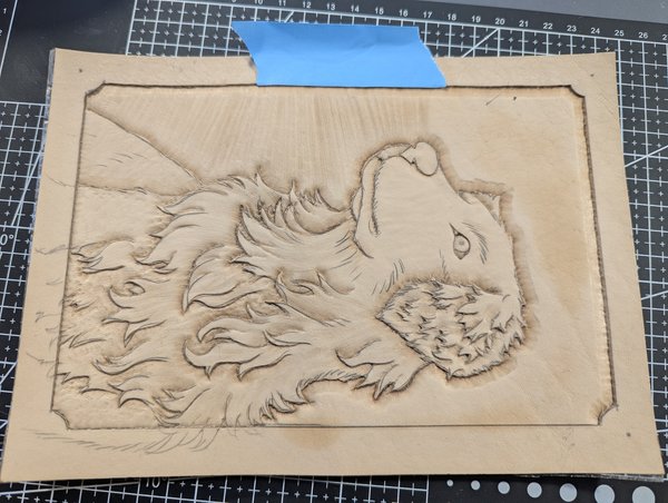
Sculpting Krypto
After learning my watery mistakes with Spooky, I made sure to use a lot less with Krypto and man, did it make a difference. You can really tell how much deeper the profile beveling is able to make an impression without having so much water in the way.
Another thing I changed is the order I did my stamping in. I started off with an extremely pointy corner bevel that I used in all the nooks and crannies of his fur. Later on this really helped keep his fur defined, not just in the texture but also when it came to painting.
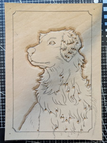
Next up was detailing the ear, so many tiny tufts of fur and little folds to navigate around!
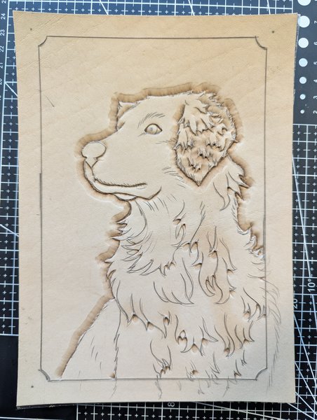
Then the rest of the body fur!
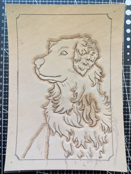
Continuing to add more and more details, but here's a good look at that warping concept I was mentioned earlier. The more it dries out, the more the leather starts to curl upwards. For the most part it flattens out again if you add more water across the whole piece, but I was trying to avoid overwatering the parts I wasn't actively stamping, because every time you add water overtop of an existing stamp impression, the more likely you are to help the leather bounce back to it's original shape and lose the stamp.
This next part was adding in the background to look like "shining rays of light" coming away from Krypto.
(the tape was there to help try and prevent me from stamping lines into the border edge)
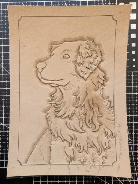
Thankfully I had a tool that would help me draw maybe 3-5 lines at a time so it wasn't as bad as it looked. All in all, the whole stamping process was actually pretty cathartic for me and I ended up getting in a really good session! I was super excited with how it turned out!!
....My downstairs neighbour, however, was not too impressed. It was around this time that he actually came knocking on my door, obviously a little frazzled, asking what the hell was going on cause it was driving him insane.
After a quick chat he actually calmed down pretty quick, I showed him what I was doing (he was legitimately curious what the hell was making that kind of rhythmic banging, lol), and we brainstormed ways to reduce sound transfer. After jerry rigging something together for that day, I promptly ordered some of those sound absorber pads you put underneath washer and dryer units with next day shipping, and I haven't heard back from him since, lol.
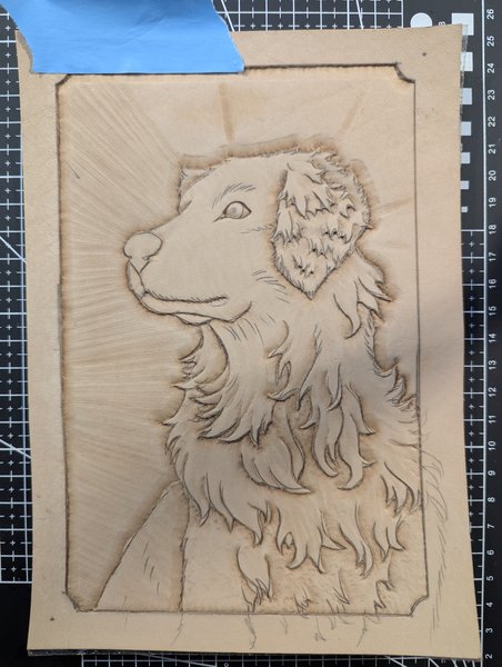
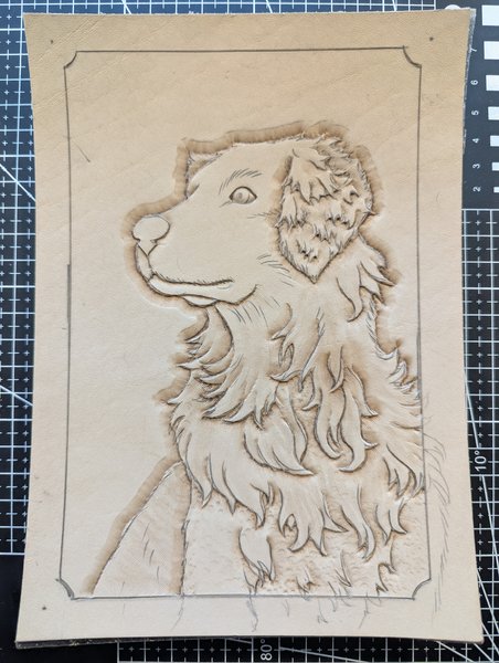
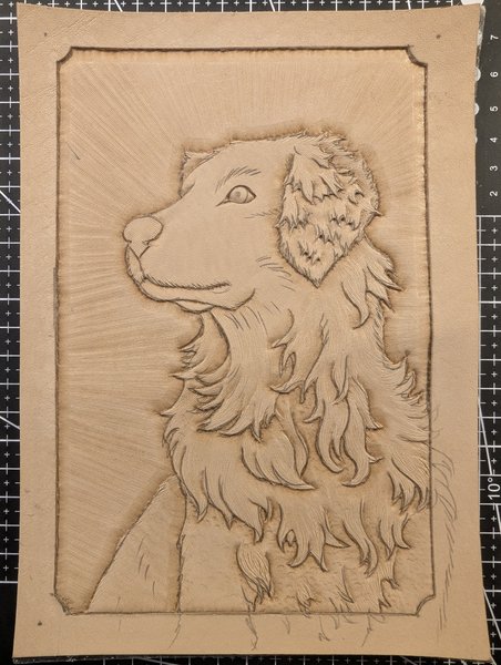
All done~!
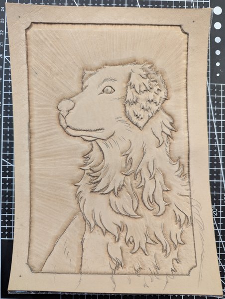
Okay now this next photo is really subtle, but I went back over all the fur and added tiny little fur lines to try and give it some more texture. My hope is that these types of lines would help catch the darker paint but not pick up any of the eventual drybrushing, giving a better illusion of actual fur. Not really sure how much of an effect it had, but it was worth a shot.
And for a bit of a bonus shot, here's what the back looked like.
With both Krypto and Spooky done, I realized I still hadn't done anything for the spine, so I quickly cobbled something together!
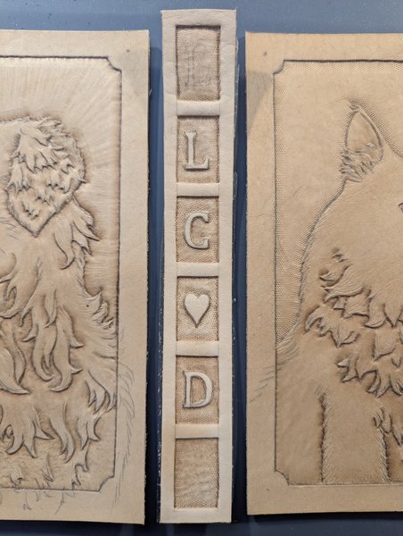
With all the more artsy sculpting done, the only thing left was to score some lines over all the places where the eventual stitches would go. Supposedly this groove would help the threads "settle" more flush with the leather and prevent them from popping out as much, but I doubt my grooving tool went deep enough for that. Either way, it ended up serving as a good guideline, so it ended up helping one way or another.
But just cause the sculpting was done, doesn't mean the leather itself was done. After using all that water to abuse the leather, you have to oil it to help it recover.
Sadly, as is the theme with these covers, I accidentally made a mistake with Spooky's cover and ended up spilling a bunch of extra oil on him... I'm not sure what type of effects that has on the final product, but I tried to let it dry out as much as possible before moving onto the next steps: Dyeing and Painting!
(god was it tempting to misspell that as 'dying')
Cost Breakdown (running totals)
| Item | Total Price (CAD) | Adjusted for Amount Used |
| Scrivener (after free trial) | $100 | n/a |
| Paper (A5, premium, 24lb text) | $45 | $45 (all of it...) |
| End papers | $15 | $5 |
| Mull | $16 | $1 |
| Book Glue | $18 | $2 |
| Ribbon | $10 |
<$1 |
| Leather | $50 |
$35* |
| Leatherworking tools/stamps | $100-$200 |
n/a |
Disclaimer: I actually used only a little over half the purchased leather in terms of square footage, but the size and shapes of the pieces left over make it pretty awkward to try and use, so I kind of bumped up the 'used amount' price to compensate. Also, as with Scrivener, I added the price of all the reusable tools I bought in order to do all this work even though they're reuable, just to bring clarity on potential "first time buy-in" costs for newbie leatherworkers
Hours spent crafting:
+1 for measuring and designing cover arrangement
+1 for printing and tracing
+3 for carving both outlines
+4 for stamping Spooky
+1 for correcting stamping on Spooky after the water-debacle
+5 for stamping Krypto
+1 for stamping Krypto's background
+2 for the spine (tracing, carving, stamping, etc)
Running Total:
+7 for the text block
+17 for sculpting the covers
Note: I did my best to exclude any "waiting times", but the estimates are probably still inaccurate and potentially even under-reported cause I'm only using photo timestamps and vague hindsight-driven vibe-feelings.
Chapter 5: The Dyeing and Painting
Chapter Text
The Dyeing
...or should I say dying?
God this process was supposed to be simple, but alas, it was not.
First application of dye had the same problem as I had when I was trying to add water to the leather before stamping: this leather was THIRSTY and it just kept absorbing the dye deep into the leather itself until the top layers started showing it's original colour again.
First layer....
Second layer...
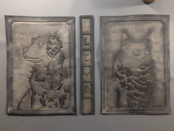
Fuck it let's skip the dye and go straight to the metallic black....
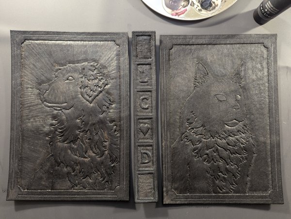
Since there was STILL some of that brown coming through on the beveled edges, lets just paint flat black...
FINALLY BLACK
but it looks too plasticy now that it's fully covered, and it was actually supposed to be metallic black so....
First coat of metallics done, time to get started on the main subjects...
The best part is that the metallics give it a bit of a glow, especially in low light or cool lights.
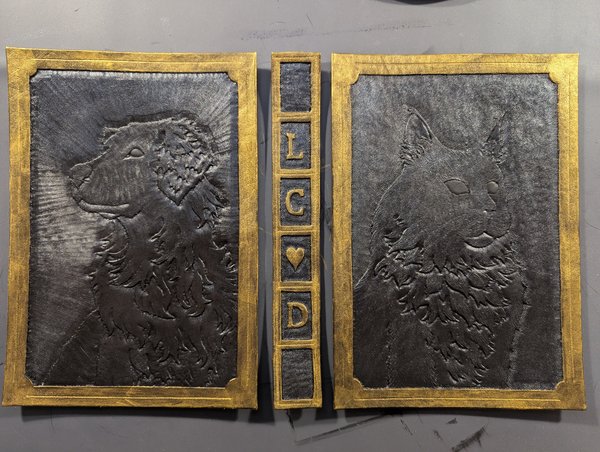
Honestly, this was a total experiment but I loved how the first layers went in! Everything is metallic, even the blue eyes which I mixed with some metallic silver. From this point on it's a matter of swapping between layers of a plain black wash (aka a very diluted black that dulls the shine and deepens the shadows of the stamps) and drybrushing more concentrated metallic gold (highlights the edges and all the raise textures).
So black wash....
Then I promptly got distracted by the background painting, lol. I wanted the pair of them to essentially be opposites: Krypto was a glowing gold center surrounded by shadow; Spooky was a shadowy void in the middle of glowing gold.
The process for both was pretty similar. First add lots of plain water to the background, then drop in a bunch of "high flow" acrylic paint around the edges and let it bleed into the pools of water until it all eventually dries. This type of paint is actually different than your standard acrylic paint and is meant for those styles of art where you pour the paint on rather than apply with a brush.
(oddly enough, the gold paint looks white when wet???)
But it's a really really vibrant gold when it dries!! Much more vibrant than the standard gold acrylic I used for the borders and the fur so far.
As for Spooky, here's a shot where I started drowning the background is watery black paint...
Then drop in the high flow acrylic gold and let it bleed!
(I had to do way more 'touch ups' with Spooky's paint puddles than Krypto, because of course cats are more difficult to work with than dogs...)
After all the was done, I went back and did a few more touch ups with gold dry brushing and voila! We're all done!
With all the painting done, it's time to seal it all up with some top coat to help protect it and give the colours an extra little boost.
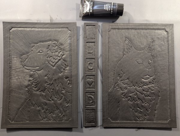
I think it was around this time that I also decided to try and flatten things back out again, so I put a "stiffening" product on the BACK of the leather and then banished all three of them to live underneath my university paperweights for a few days. Once that was done, they came out nice and flat!
....did I mention how much I love the low light glow these guys have?
Because I love it.
A lot.
So much.
💖💖💖💖💖
Oh and before I forget, it was around this time that I also went ahead and painted the page edges black. I wasn't too sure how to do it but I found what I thought was an okay guide online that said using acrylic paints would be fine as long as you worked in really thin layers so... Off I went!
Back in the clamp the text block goes...
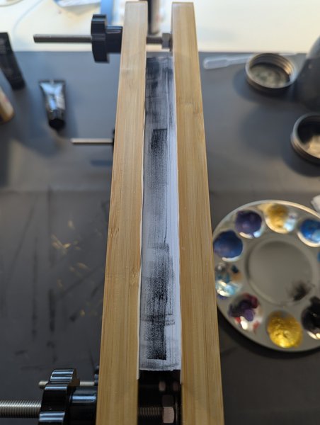
Very slowly building up layers....
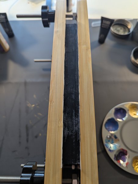
Eventually get fed up and put probably far too much paint on the edges (and that will come to bite me in the butt later on...)
Unforutnately, while it did end up finally getting full coverage, it was not a pretty process and I could tell that the paint was far too thick and not settling well on the page edges. If I were to retry painting edges (maybe on some thiftstore books for practice?) I think I would try something else like gouache (which I thankfully already have a lot of). For those who don't know, gouache can often look like acrylic paint, but it actually behaves a lot more like watercolour, meaning it is easy to use in very thin layers yet still stays vibrant in colour.
Anyways, next up: final assembly!!
Cost Breakdown (running totals)
| Item | Purchase Price (CAD) | Amount Used (CAD) |
| Scrivener (after free trial) | $100 | n/a |
| Paper (A5, premium, 24lb text) | $45 | $45 (all of it...) |
| End papers | $15 | $5 |
| Mull | $16 | $1 |
| Book Glue | $18 | $2 |
| Ribbon | $10 | <$1 |
| Leather | $50 | $35 |
| Leatherworking tools/stamps | $150 | n/a |
| Leather dyes + sealant | $30 | $5 |
| Misc Painting Supplies (5 types of paint) | $30 | $2? |
| Total: | $464 | $95 |
Disclaimer: I actually used only a little over half the purchased leather in terms of square footage, but the size and shapes of the pieces left over make it pretty awkward to try and use, so I kind of bumped up the 'used amount' price to compensate. Also, as with Scrivener, I added the price of all the reusable tools I bought in order to do all this work even though they're reuable, just to bring clarity on potential "first time buy-in" costs for newbie leatherworkers
Hours spent crafting:
+1 for dyeing and painting base coat
+2 for painting the borders
+1 for first layers of painted fur
+2 for alternating layers of black wash and gold drybrush
+1 for the background glows
+2 for the black edges
Running Total:
+7 for the text block
+17 for sculpting the covers
+9 for dyeing and painting
Note: I did my best to exclude any "waiting times", but the estimates are probably still inaccurate and potentially even under-reported cause I'm only using photo timestamps and vague hindsight-driven vibe-feelings.
Chapter 6: The Assembly!
Chapter Text
Stitching the Cover
Okay so admittedly I think I left out a few details earlier on related to the more standard bookbinding process, so to catch us up:
- After gluing together the text block, I took measurements of the thickness of the stack as well as the height of the pages + the little bits of headband poking out
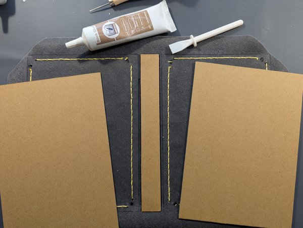
- Using these measurements I had cut out 3 pieces of chipboard that would serve as the main structure of the hardcover.
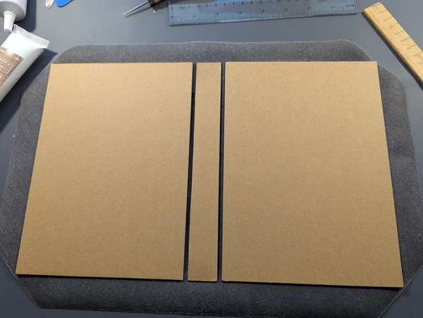
- From these three pieces of chipboard I cut out two things:
- A section of "book cloth" (in this case black faux-leather) that will eventually wrap around the pieces of chipboard to hold them together.
- Three matching (but ever so slightly larger) pieces of leather. Technically the extra width/height of the leather was needed to compensate for the extra thickness of the book cloth since I didn't want any of the black cloth to be seen around the edges of the leather covers.
With that out of the way, I pulled out the book cloth and laid the three pieces of leather on top, gluing them all in place.
When it comes to leather, though, you almost never use glue alone. It's pretty standard to add in some stitching for extra security, so for that I needed to go along those groove lines I put in and essentially hammer out a lot of holes through the main leather pieces and the underlying faux-leather. That process took what felt like forever because I actually had to go over all the holes multiple times:
- First you use a "pricking iron" to mark where the holes will go, almost like how you might put a small prick in the wall to act as a guide before you pull out the power drill.
- Then you go around to all the guide marks using a mallet and an "awl" (basically a specialized stabber thing)
- Then you go around ONE MORE TIME with an even thicker awl because you're me and you keep underestimating how big the holes need to be.
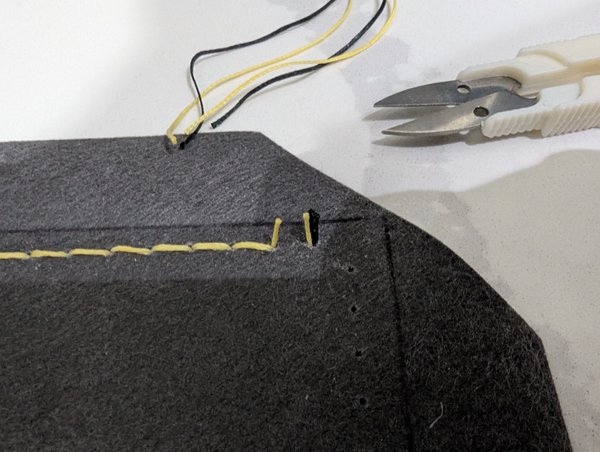
Anyways, I did all that in sections, starting with the spine. Once the holes were in place, it was time to do some stitching!
So the style of stitch I did on the spine is actually pretty simple, which is the reason I started with it. Better to get warmed up before jumping straight into the deep end, right?
Once I got into a rhythm I was able to turn on the TV and multitask a bit, and here's how far I got after an hour:
In total it took 3 full hours to do just the spine, but I liked how it ended up (even if the lines were a tad wonky 😅)
Now it's time for the hard part, the super fancy variant of the double-coloured "novagese stitch" (also known as the Norwegian stitch I think?)
To do this stitch, you're probably better off watching a more dedicated tutorial, like this 7 minute video by Claridge Leather.
For my totally ridiculous perspective on it--and honestly confusing description--first you have to try and do a normal stitch with your "line colour" (in my case, yellow), but stop halfway so you leave a giant loop open. Then you take your "cross colour" (in my case, black) and loop them through the hoop after you twist them around a bit like a big ol' S shape.
Sound complicated? Yeah. It's complicated. I messed up a few times, but eventually found a rhythm an hour or so in, lol.
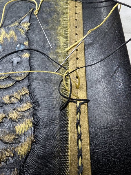
Once you're all set up, you slowly start to pull all 3 thread tight (the yellow hoop and the two black S threads). If you've done it right, the stitching should start to look like a series of black X's separated by the yellow lines that kinda blend in with the gold border.
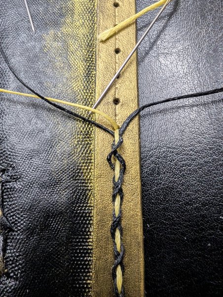
Once you're pulled all snug, you start on the next stitch by pulling out yet another yellow loop and doing it all over again and again and again....
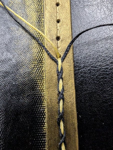
...until you eventually get a full line of stitches that only took you a bajillion hours to do and the first half of them were definitely not pulled tightly enough 😅
But none of that matters because now we're at the best part: You've finished the stitches but you still have to "tie off" the ends or else the whole thing will start to unravel.
Why is this the best part?
Because you can use FIRE to melt the thread ends!
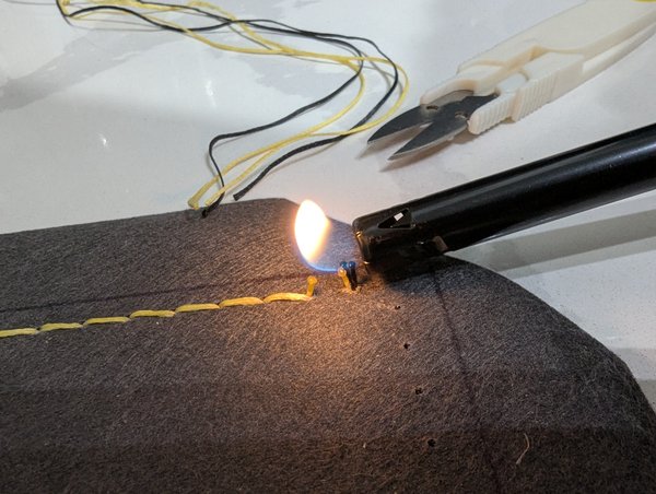
Then once the threads have melted a bit, you wait a second for them to cool just enough to not be actively melting yet not so much that the threads can't be pressed into a disk using the back of the lighter, like so:
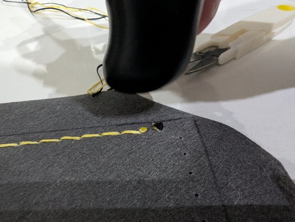
Once that's done, you just rinse and repeat the whole process until eventually you get a visitor who tries REALLY hard to guilt trip you into putting your project down and paying attention to her instead...
And after all those trials and tribulations, you finally finish up the stitching and admire your work!
Final Assembly!!
First up, glue the chipboard pieces to the back of the book cloth, using the stitch lines and prior outline marks as guides. Don't forget to loose a few more brain cells thanks to the glue fumes.
Might as well give yet another shout out to my favourite university paperweights, they've really been putting in their hours with this project.
Next it was time to glue all the overhanging flaps back around the chipboard.
Round and round you go until it's all done!
I didn't include any pictures of these details, but just so you know:
I apparently cut one edge a tad short (bottom left in the above pic) and the chip board was showing through a lot. I couldn't really "fix" this, but I was able to take some of the black paint and just fill in the space so that the chipboard blends in with the cloth and isn't as noticable.
I also noticed that the book covers didn't really bend that easily around the spine because the book cloth was so thick, so to mitigate that I actually cut the inside flaps in those 4 gaps you see around the spine. With the cloth cut like that it wouldn't need to bend as much so it became easier to open and close.
Anyways, enough of that, here's some shots of what the assembled cover looked like!
Now to bring in the text block... but whoops! As I was lining up the text block with the cover underneath, I forgot I hadn't actually broken up the page edges after painting them, so let's do that first.
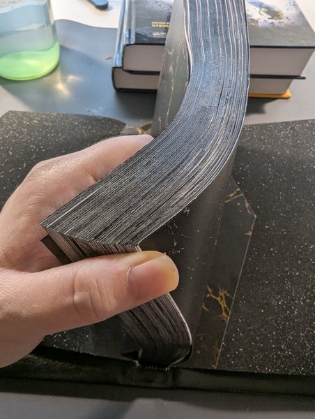
After some breif bending this way and that, I set out pulling each and every page apart, one by one, working from outwards in, until eventually every single page was free from it's neighbour.
(pages kept blurry cause obviously the middle of the book and be quite spoilery, lol)
Sadly, after all was said and done, I realize I had accidentally stripped off some of the black paint 😢 Honestly I'm not surprised, though, as mentioned before I knew I had put too much acrylic on and that acrylic in general probably wasn't the greatest option, but oh well, lessons learned!
Cost Breakdown
| Item | Purchase Price (CAD) | Amount Used (CAD) |
| Scrivener (after free trial) | $100 | n/a |
| Paper (A5, premium, 24lb text) | $45 | $45 (all of it...) |
| End papers | $15 | $5 |
| Mull | $16 | $1 |
| Book Glue | $18 | $2 |
| Ribbon | $10 | <$1 |
| Leather | $50 | $35 |
| Leatherworking tools/stamps | $150 | n/a |
| Leather dyes + sealant | $30 | $5 |
| Misc Painting Supplies (5 types of paint) | $30 | $2? |
| Chipboard | $25 | $2 |
| Faux-Leather Book Cloth (48"x17") | $22 | $5 |
| Total: | $511 | $102 |
Disclaimer: The thread costs were included in the original "leatherworking supplies kit" but since it's impossible to calculate the price as I bought most of the tools as a set... I'm just going to ignore them since they would be relatively cheap anyways. I also only included the price of a single set of buttons even though I technically bought more for testing purposes.
Hours spent crafting:
+1 for hole punching
+3 for stitching spine
+8 for stitching both covers
+1 for page breaks and final gluing
Running Total:
+7 for the text block
+17 for sculpting the covers
+9 for dyeing and painting
+13 for assembly
Disclaimer: The hours reported here are those spent actively working on the task at hand and do not include wait times. I also did not include time spent brainstorming, researching, or otherwise looking up details on how to do something.
Chapter 7: The Buttons!
Summary:
Finally added the buttons I was mentioning!
(if you're a subscriber, the first half is a bit of a repeat, but there's new photos in the second half and I also added some of the updated photos to the original chapter 1 "finished product" set)
Chapter Text
The Buttons....
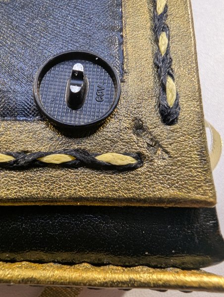
Okay so as mentioned, the buttons are still missing from the final product, but I had started "testing" which buttons I liked best after I finished the stitching, as I had a few colour options:
Pre-owned snap rivets : This was a small collection of different rivets I had on hand from my original leatheworking kit to get a feel for things at first. Top left is gold, top right is bronze, bottom left is silver (currently reflecting my pale ass elbow....), and bottom right is "black" (but lets be real, that's not a true black).
In reality I thought the top left gold was too shiny and took too much attention away from the main characters, while the silver was essentially a wild card as it would just reflect whatever colours were nearby. I liked both the bronze and the black, but for different reasons: Bronze because it blended in and black because it stood out yet fit the clear black/gold pattern of the border stitching.
Ordered new buttons : Moving forwared with the two options I liked before, I ordered a new set of bronze and black buttons this time.
Honestly, I had the same opinions as before: I liked both but they have opposite effects, one blends in and the other stands out, but both match and accentuate the main characters.
Ultimately I was leaning towards black at this point, especially cause that was actually part of the original design, but just to be sure I tried to take more pictures and at this point I might as well share, lol.
Unfortunately, they have nobs on the back that I would need to file off and until then, they'll sit on the covers at wonky angles. I also took photos in different lights because I have definitely mentioned how much I love this book when it glows right?
Attaching the Buttons
So normally real leathworkers would add the "rivets" (aka decorative metal "buttons") to the leather cover using a specialized kit that doesn't use glue. They would also have done this after doing the stitching but prior to gluing it to the chipboard. Did I do that? Nope. Instead I bought metal shirt buttons, shaved off the back "hooks", hacked some indentations in the corners with an exacto knife, then super glued them together:
But with that, we're actually all done here! It was a great ride and I really do hope to hear what people thought in the comments, especially if you've got any experience with these things and can help me correct my mistakes!
Cost Breakdown
| Item | Purchase Price (CAD) | Amount Used (CAD) |
| Scrivener (after free trial) | $100 | n/a |
| Paper (A5, premium, 24lb text) | $45 | $45 (all of it...) |
| End papers | $15 | $5 |
| Mull | $16 | $1 |
| Book Glue | $18 | $2 |
| Ribbon | $10 | <$1 |
| Leather | $50 | $35 |
| Leatherworking tools/stamps | $150 | n/a |
| Leather dyes + sealant | $30 | $5 |
| Misc Painting Supplies (5 types of paint) | $30 | $2? |
| Chipboard | $25 | $2 |
| Faux-Leather Book Cloth (48"x17") | $22 | $5 |
| Metal Buttons (set of 10) | $11 | $10 |
| Jewelry saw | $15 | n/a |
| Total: | $537 | $112 |
Disclaimer: The jewelry saw was borrowed and honestly it was only needed because of me really weirdly unprepared self that didn't do the buttons the proper leatherworking way.
Hours spent crafting:
+0.5 for cutting and gluing the buttons
Final Total:
+7 for the text block
+17 for sculpting the covers
+9 for dyeing and painting
+13 for assembly
+0.5 for butons
=46.5 hours (over the course of 6 months)
Disclaimer: The hours reported here are those spent actively working on the task at hand and do not include wait times. I also did not include time spent brainstorming, researching, or otherwise looking up details on how to do something.
Pages Navigation
Iliketophats on Chapter 1 Fri 22 Aug 2025 11:00PM UTC
Comment Actions
bajuwa on Chapter 1 Sat 23 Aug 2025 01:05AM UTC
Comment Actions
ZeroMonster on Chapter 1 Fri 22 Aug 2025 11:18PM UTC
Comment Actions
bajuwa on Chapter 1 Sat 23 Aug 2025 01:06AM UTC
Comment Actions
Wade (Guest) on Chapter 1 Fri 22 Aug 2025 11:18PM UTC
Comment Actions
bajuwa on Chapter 1 Sat 23 Aug 2025 01:28AM UTC
Comment Actions
AWarriorAtHeart1 on Chapter 1 Sat 23 Aug 2025 12:01AM UTC
Comment Actions
bajuwa on Chapter 1 Sat 23 Aug 2025 01:04AM UTC
Comment Actions
AWarriorAtHeart1 on Chapter 1 Sat 23 Aug 2025 04:08AM UTC
Comment Actions
bajuwa on Chapter 1 Sat 23 Aug 2025 05:15AM UTC
Comment Actions
AWarriorAtHeart1 on Chapter 1 Sat 23 Aug 2025 05:21AM UTC
Comment Actions
Alfreddabuttler2ts on Chapter 1 Sat 23 Aug 2025 12:18AM UTC
Last Edited Sat 23 Aug 2025 12:18AM UTC
Comment Actions
bajuwa on Chapter 1 Sat 23 Aug 2025 01:28AM UTC
Comment Actions
adamolupin on Chapter 1 Sat 23 Aug 2025 01:52AM UTC
Comment Actions
bajuwa on Chapter 1 Sat 23 Aug 2025 02:00AM UTC
Comment Actions
Watshy on Chapter 1 Sat 23 Aug 2025 03:28AM UTC
Comment Actions
bajuwa on Chapter 1 Sat 23 Aug 2025 04:33AM UTC
Comment Actions
flwrstcker on Chapter 1 Sat 23 Aug 2025 09:34AM UTC
Comment Actions
bajuwa on Chapter 1 Sat 23 Aug 2025 04:50PM UTC
Comment Actions
SorryIWasAsleep on Chapter 1 Mon 25 Aug 2025 10:32PM UTC
Comment Actions
SorryIWasAsleep on Chapter 1 Mon 25 Aug 2025 10:32PM UTC
Comment Actions
SorryIWasAsleep on Chapter 1 Mon 25 Aug 2025 10:32PM UTC
Comment Actions
bajuwa on Chapter 1 Tue 26 Aug 2025 03:58AM UTC
Comment Actions
Raphael_The_Fallen on Chapter 1 Thu 04 Sep 2025 05:30AM UTC
Comment Actions
bajuwa on Chapter 1 Wed 15 Oct 2025 03:36AM UTC
Comment Actions
Lily_Jem on Chapter 1 Wed 24 Sep 2025 06:59PM UTC
Comment Actions
SleepySongs on Chapter 1 Mon 27 Oct 2025 07:57PM UTC
Comment Actions
turnip_queen on Chapter 1 Wed 05 Nov 2025 09:29AM UTC
Comment Actions
C1b3r_V4n1l4 on Chapter 2 Sat 23 Aug 2025 01:38AM UTC
Comment Actions
bajuwa on Chapter 2 Sat 23 Aug 2025 02:12AM UTC
Comment Actions
Iliketophats on Chapter 2 Sat 23 Aug 2025 01:30PM UTC
Comment Actions
bajuwa on Chapter 2 Sat 23 Aug 2025 04:56PM UTC
Comment Actions
Ardwynna on Chapter 3 Sat 23 Aug 2025 01:41PM UTC
Comment Actions
bajuwa on Chapter 3 Sat 23 Aug 2025 04:57PM UTC
Comment Actions
Aldan on Chapter 3 Sun 24 Aug 2025 05:14AM UTC
Comment Actions
bajuwa on Chapter 3 Sun 24 Aug 2025 05:17AM UTC
Comment Actions
AWarriorAtHeart1 on Chapter 6 Mon 25 Aug 2025 05:27AM UTC
Comment Actions
bajuwa on Chapter 6 Mon 25 Aug 2025 05:31AM UTC
Comment Actions
AWarriorAtHeart1 on Chapter 6 Mon 25 Aug 2025 05:34AM UTC
Comment Actions
Pages Navigation